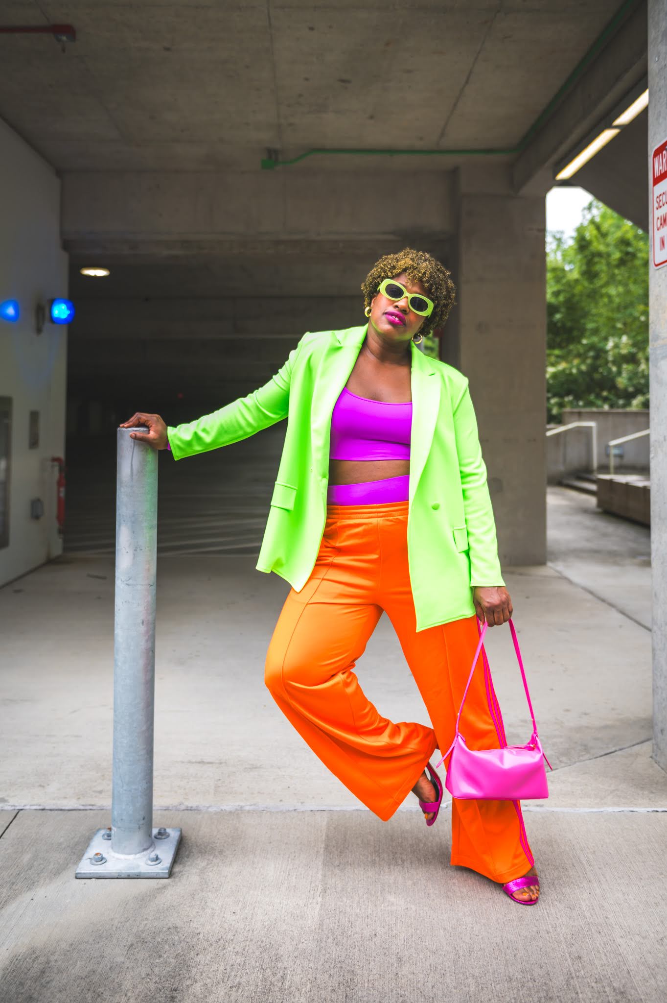
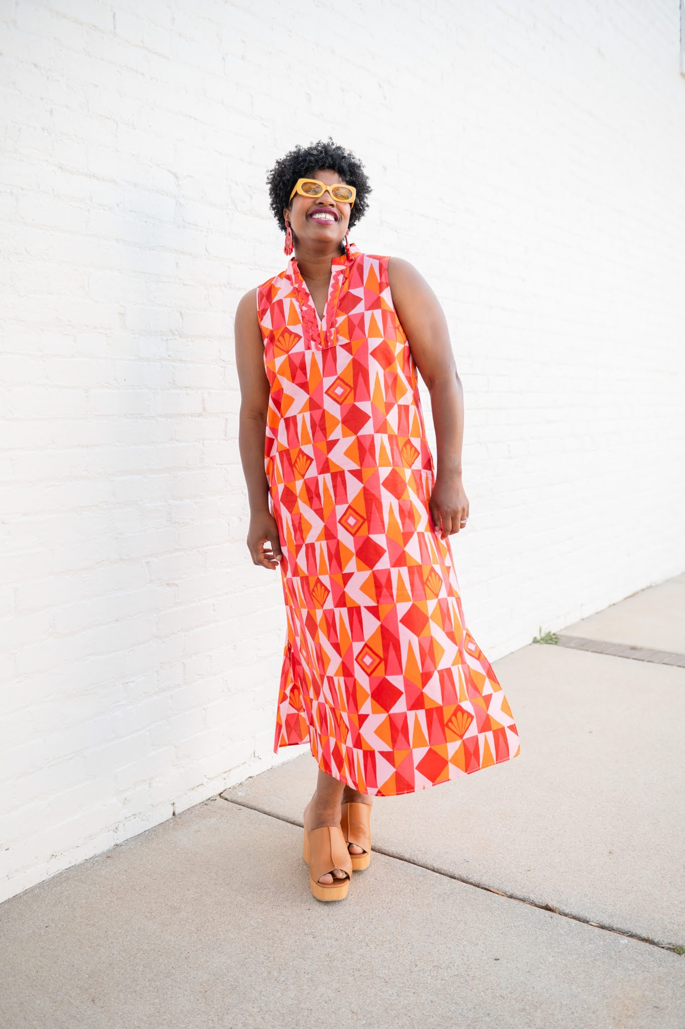
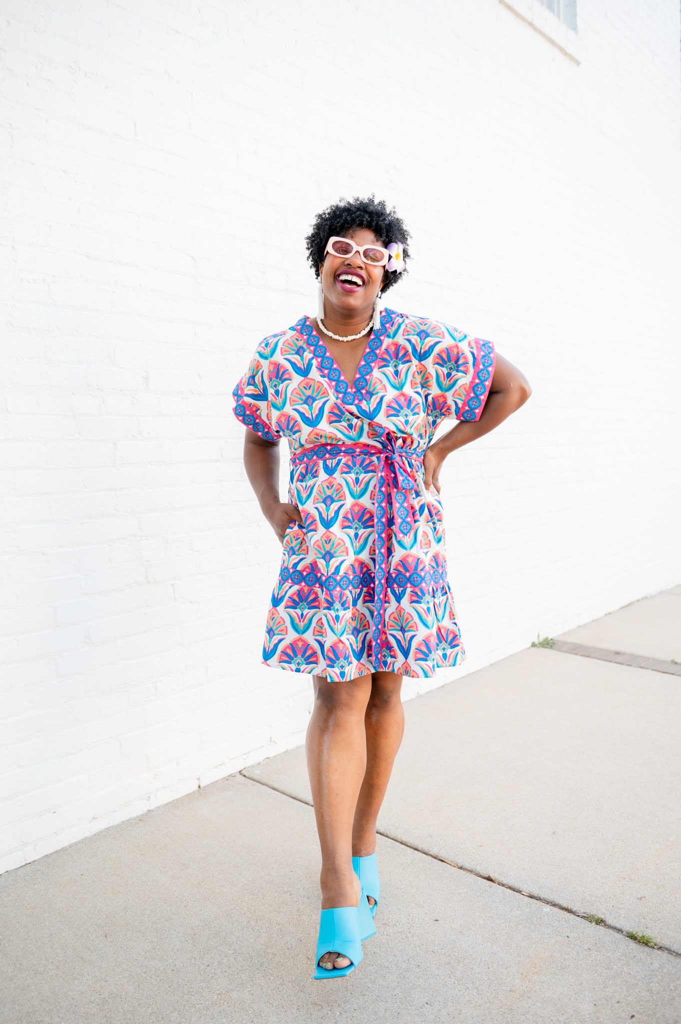
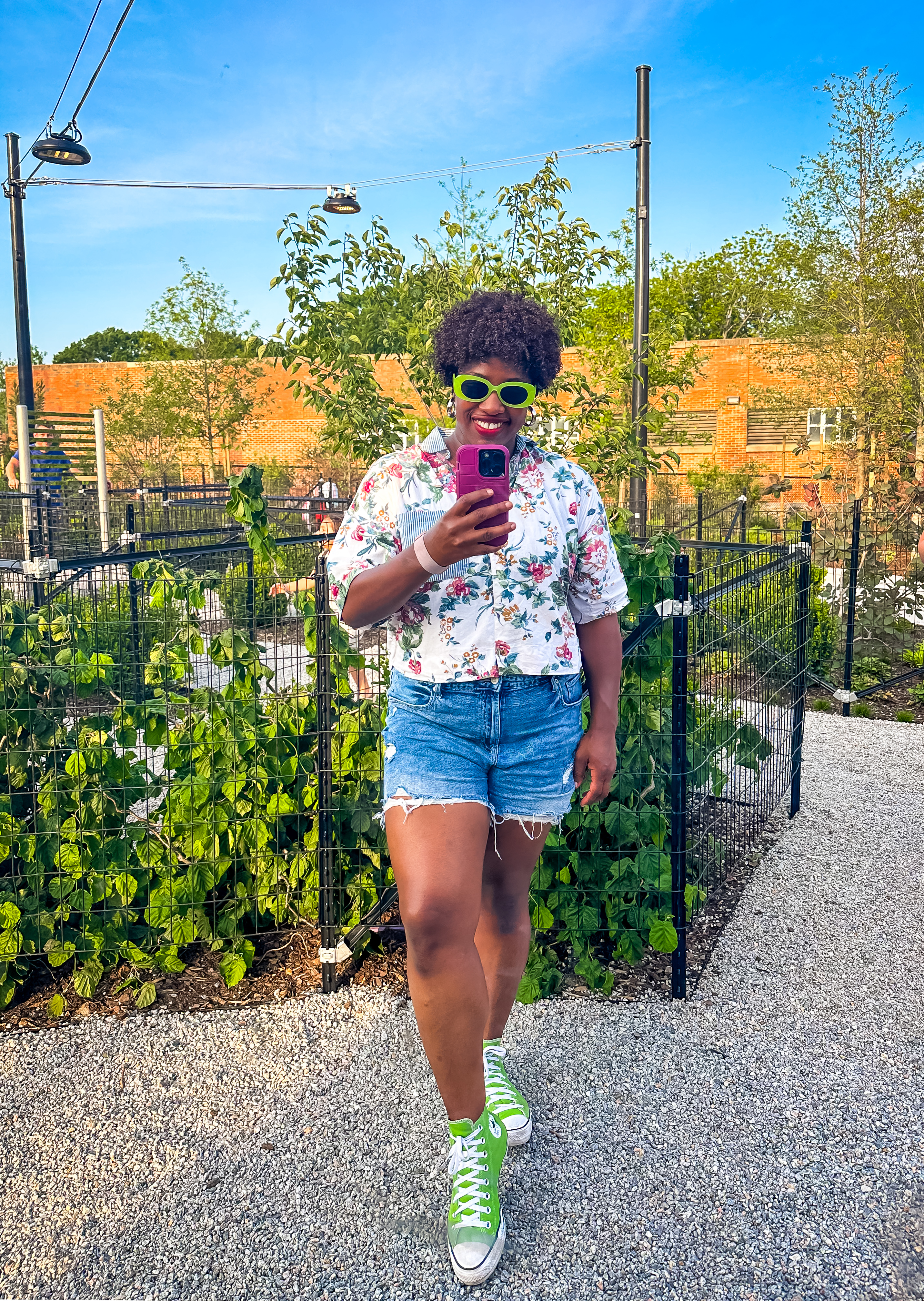
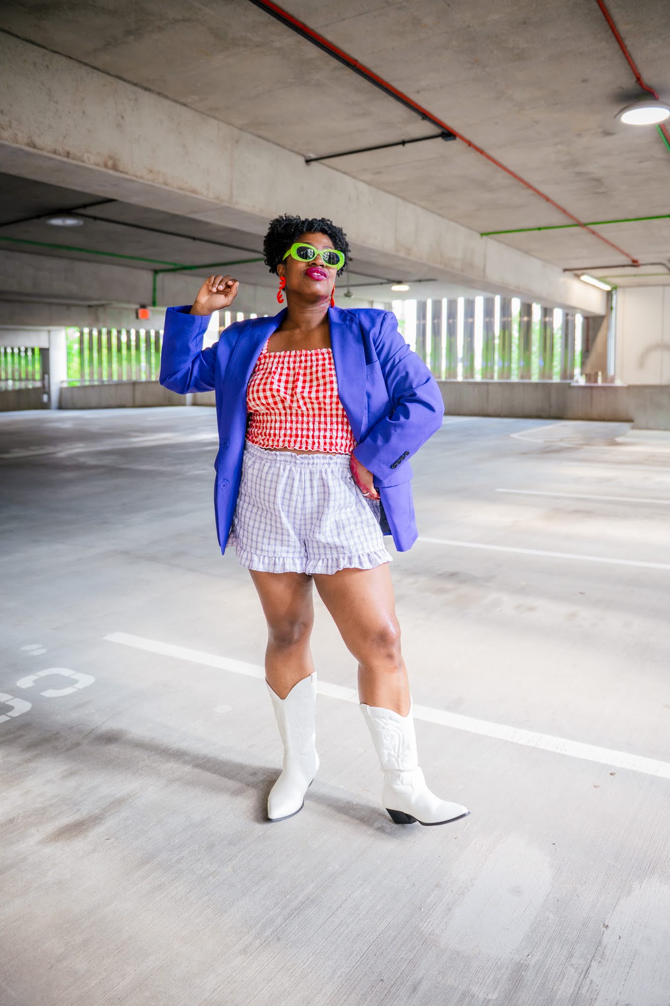
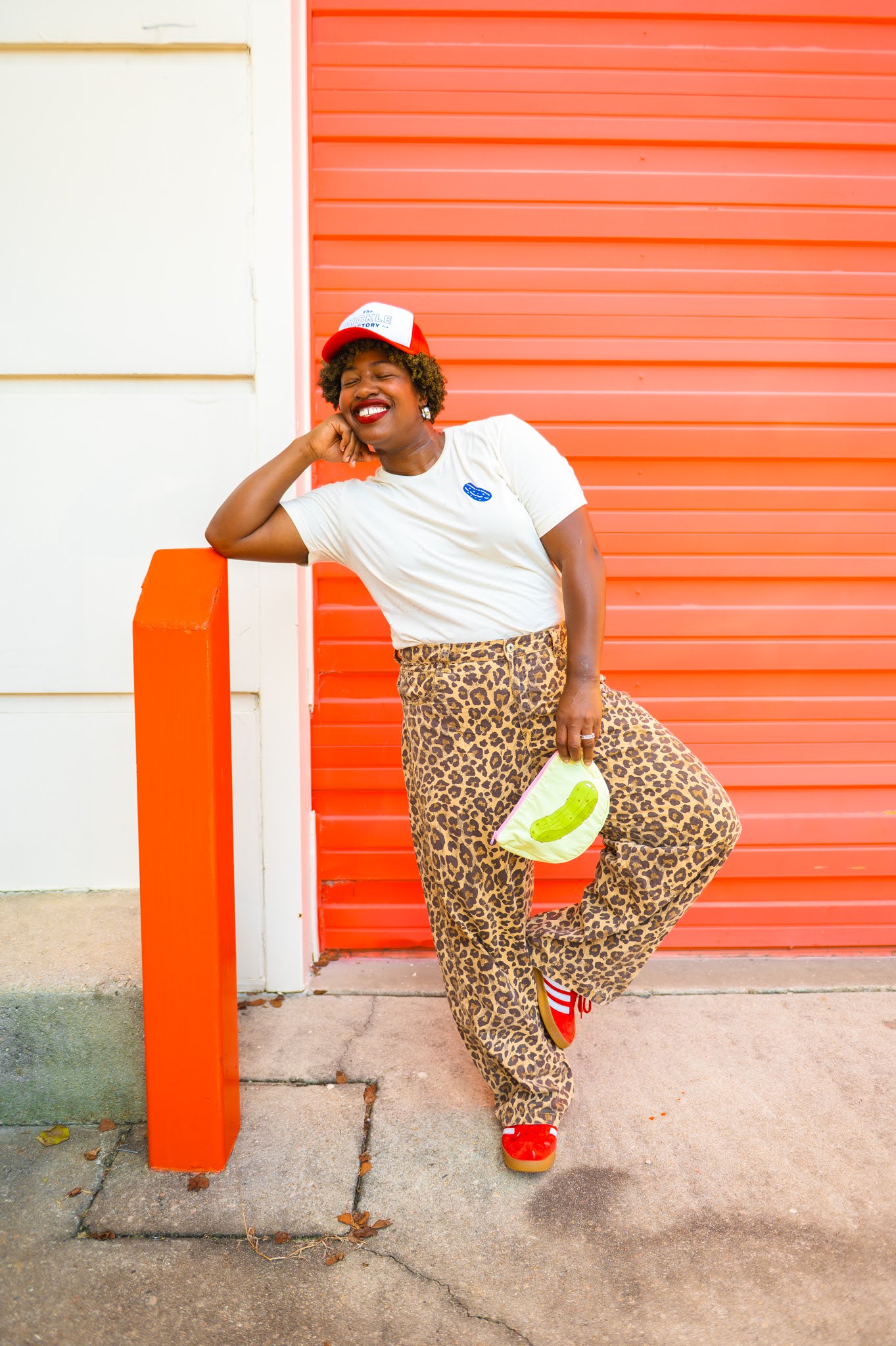
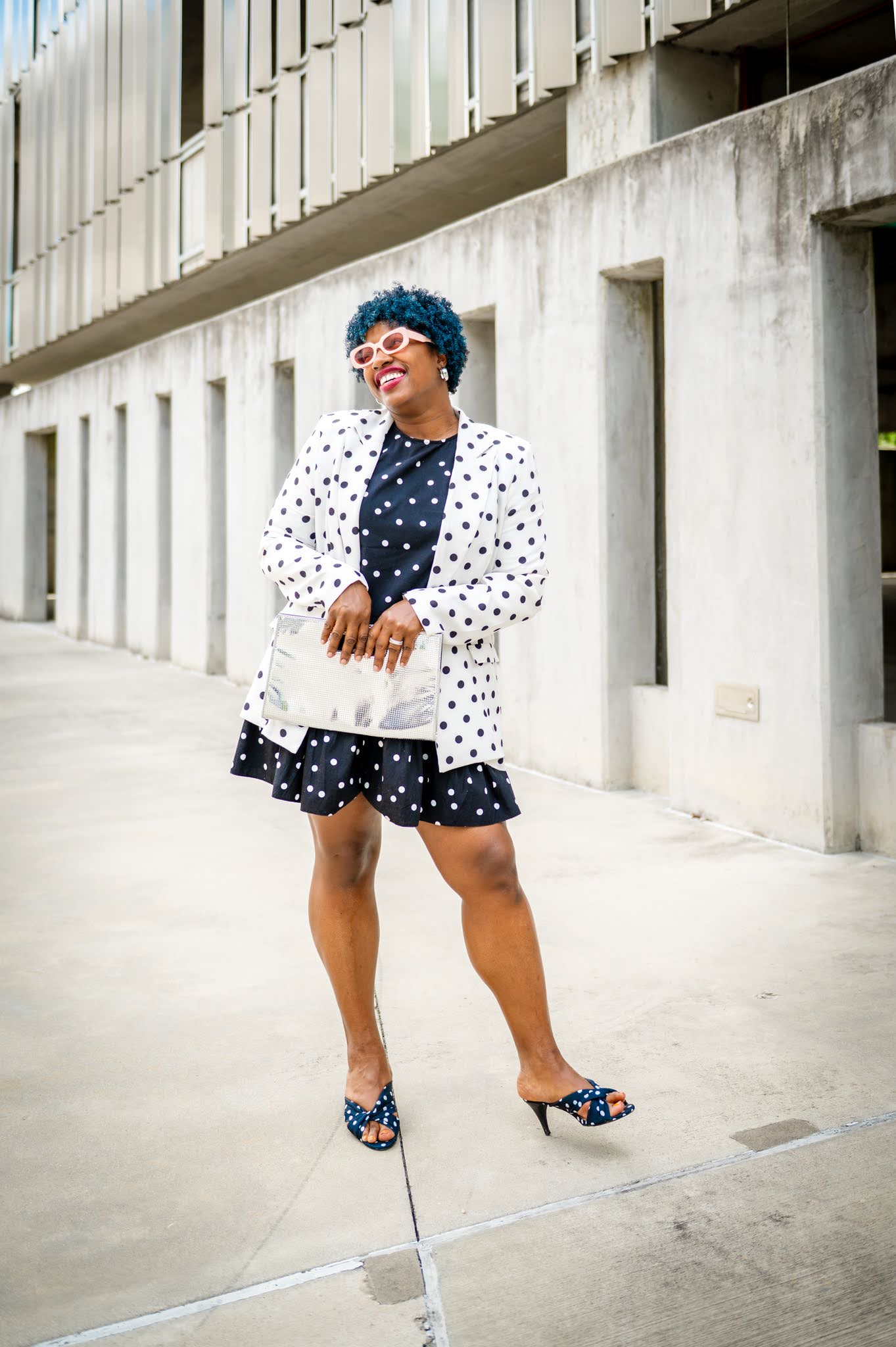
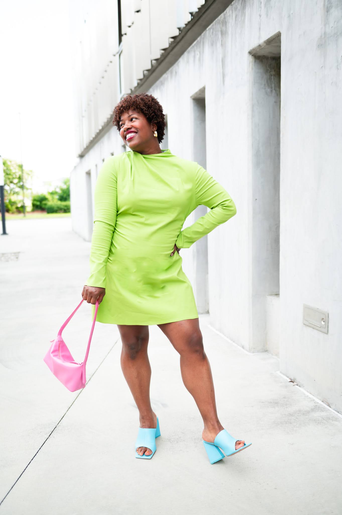
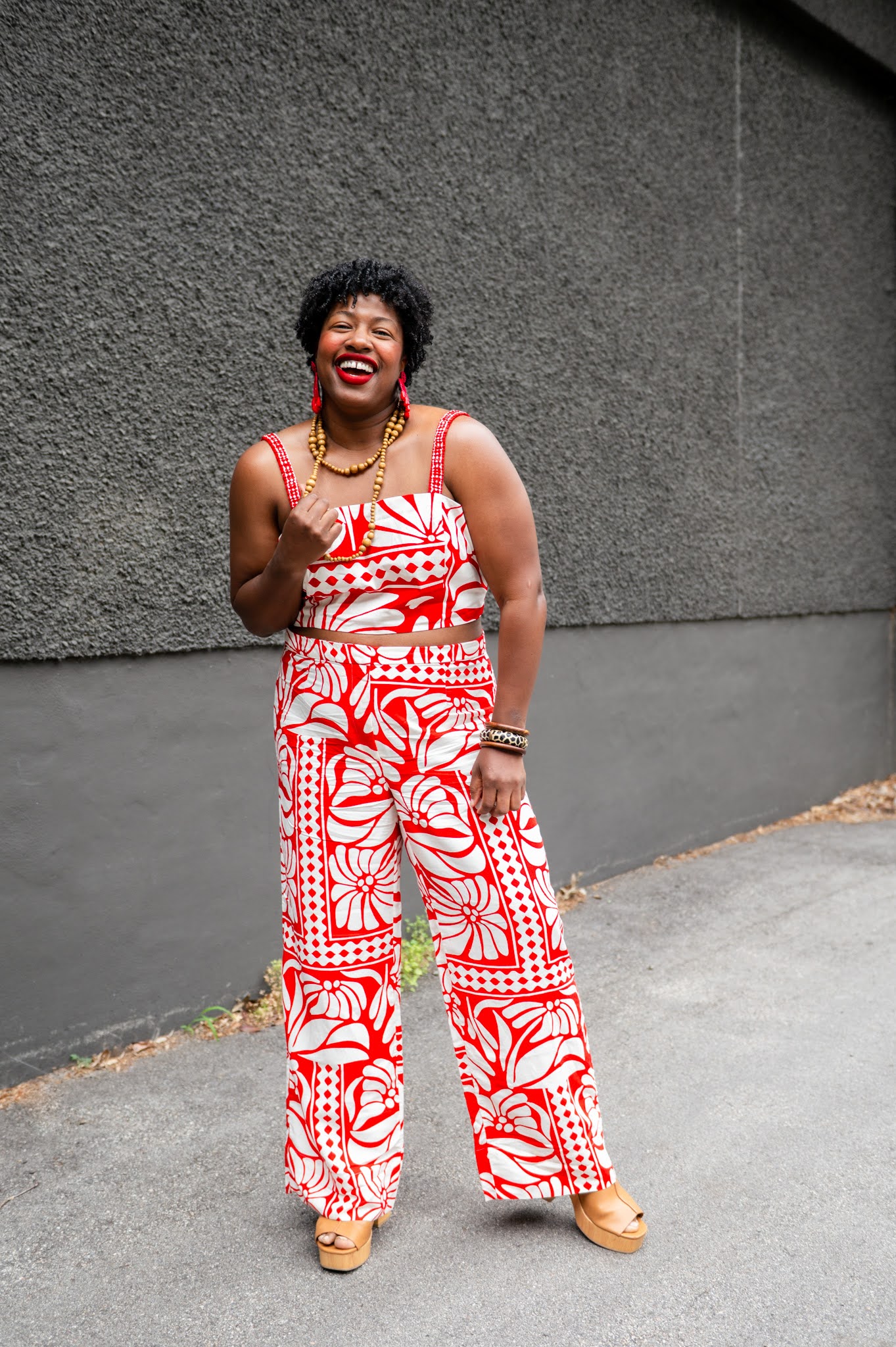
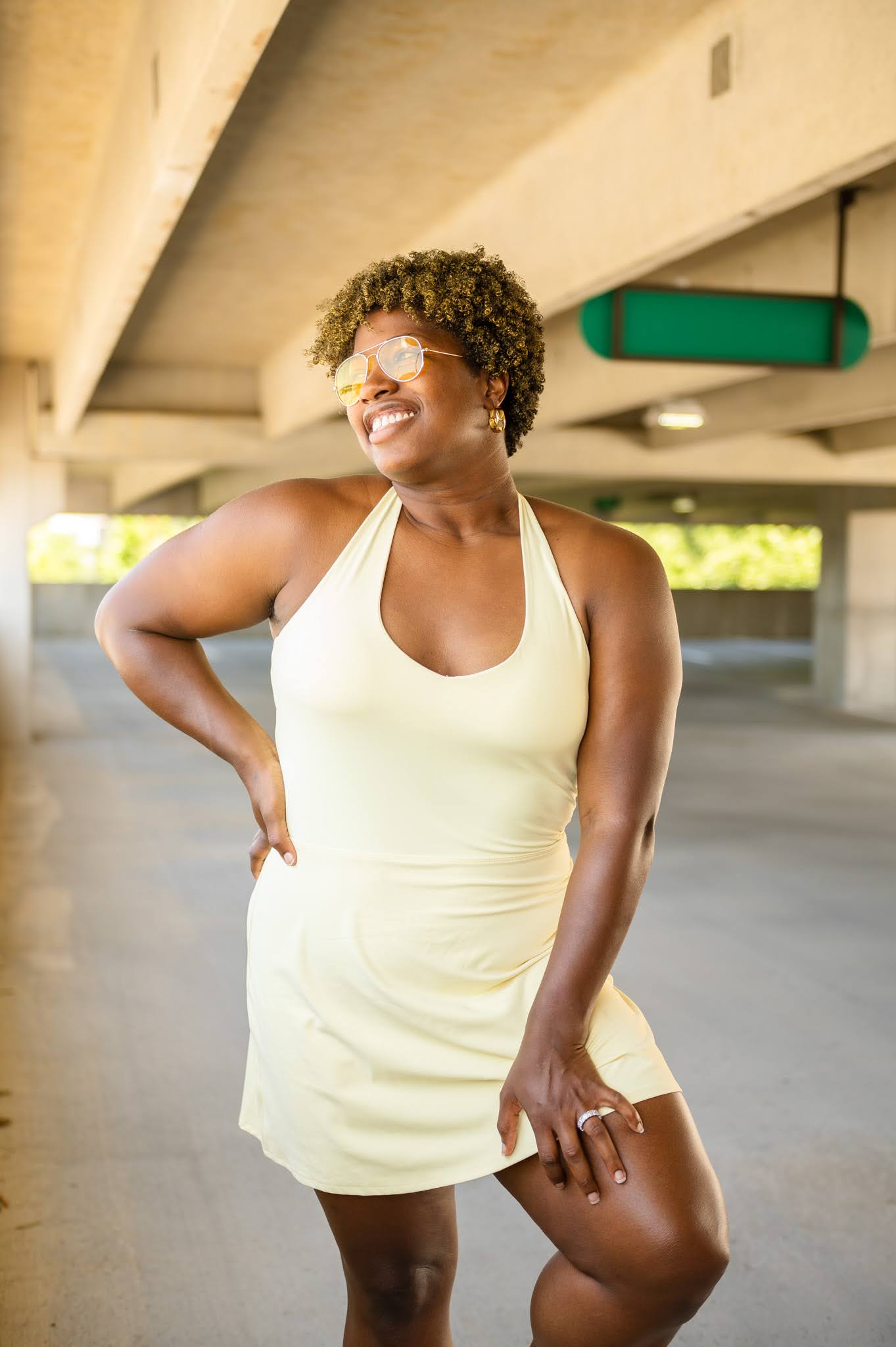
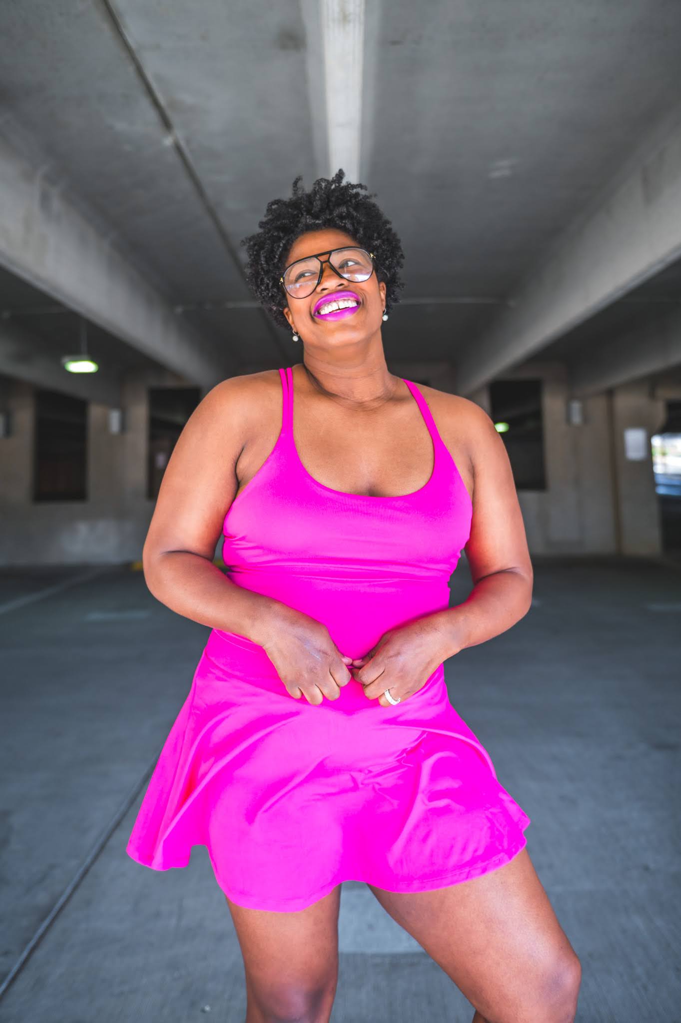
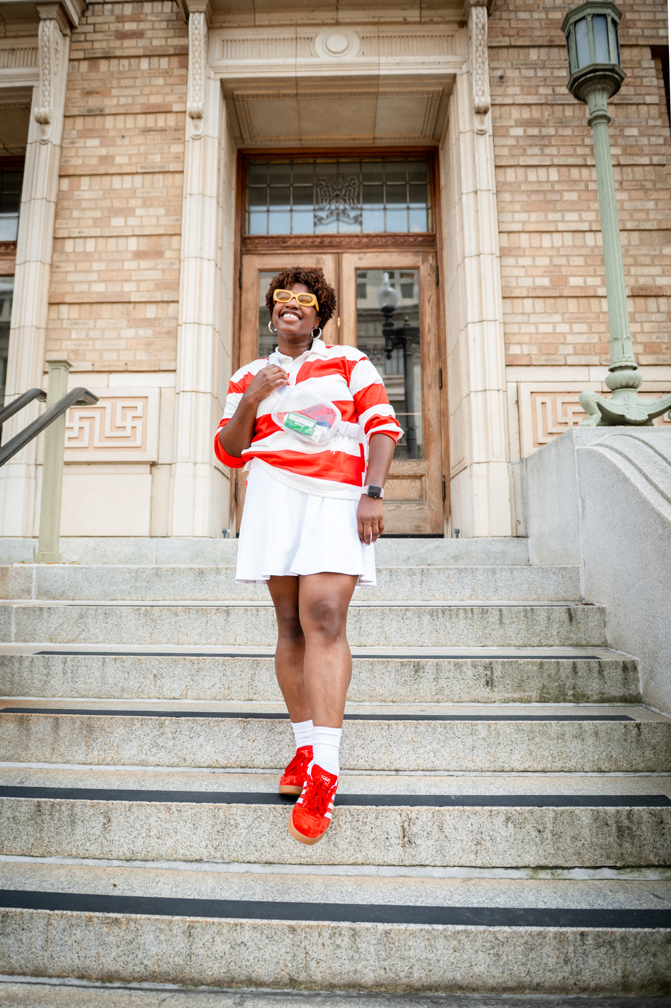
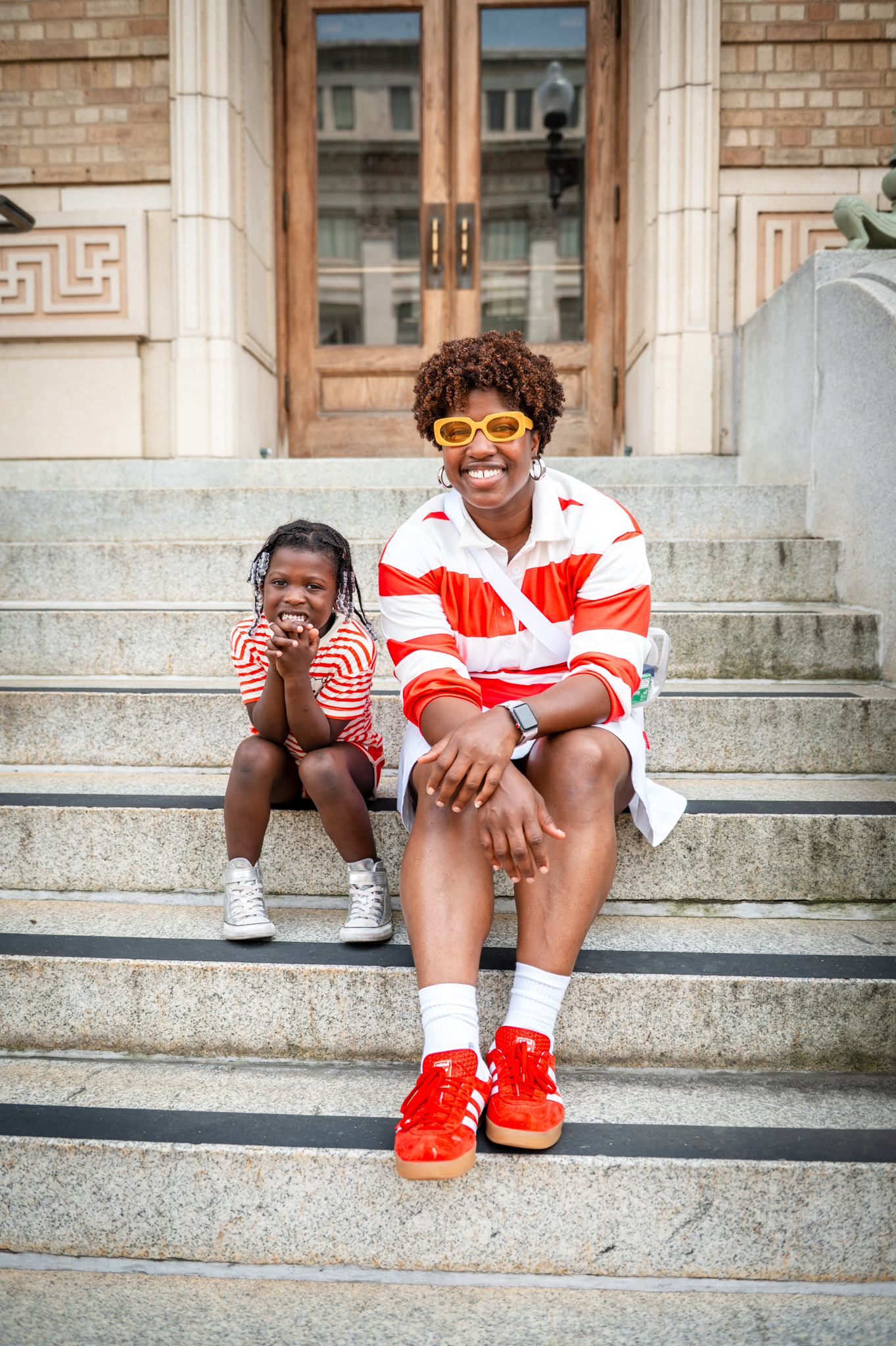
Not gonna lie, the summer wardrobe picks have been on point this year. I’m really coming into my own these days and rediscovering my personal style on a whole new level. Fashion trends be damned.
I’ve been playing around a lot with color, patterns and shapes all summer and I’m pleased with how a lot of the looks have come together. It also helps that I’m shopping my closet these days. I’ve really been digging repurposing pieces I already have readily available in my closet. Crazy part is, some of the things I’ve been finding still have tags on them. Ugh, I know, shame on me, but I’m here now, doing better and learning from the past.
Here’s a few summer looks I put together that prove all of this hodge podge I’m talking about is actually real.
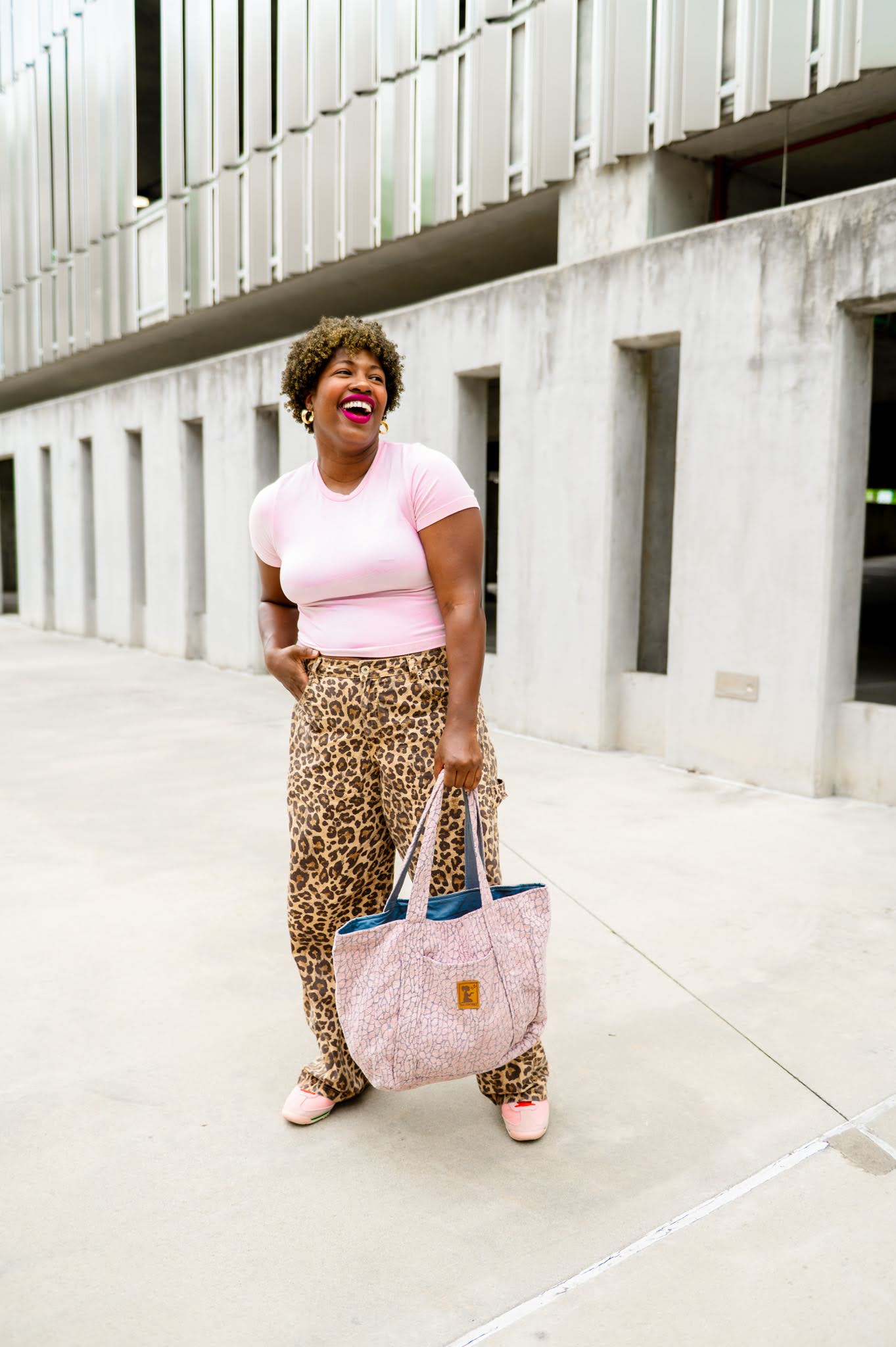
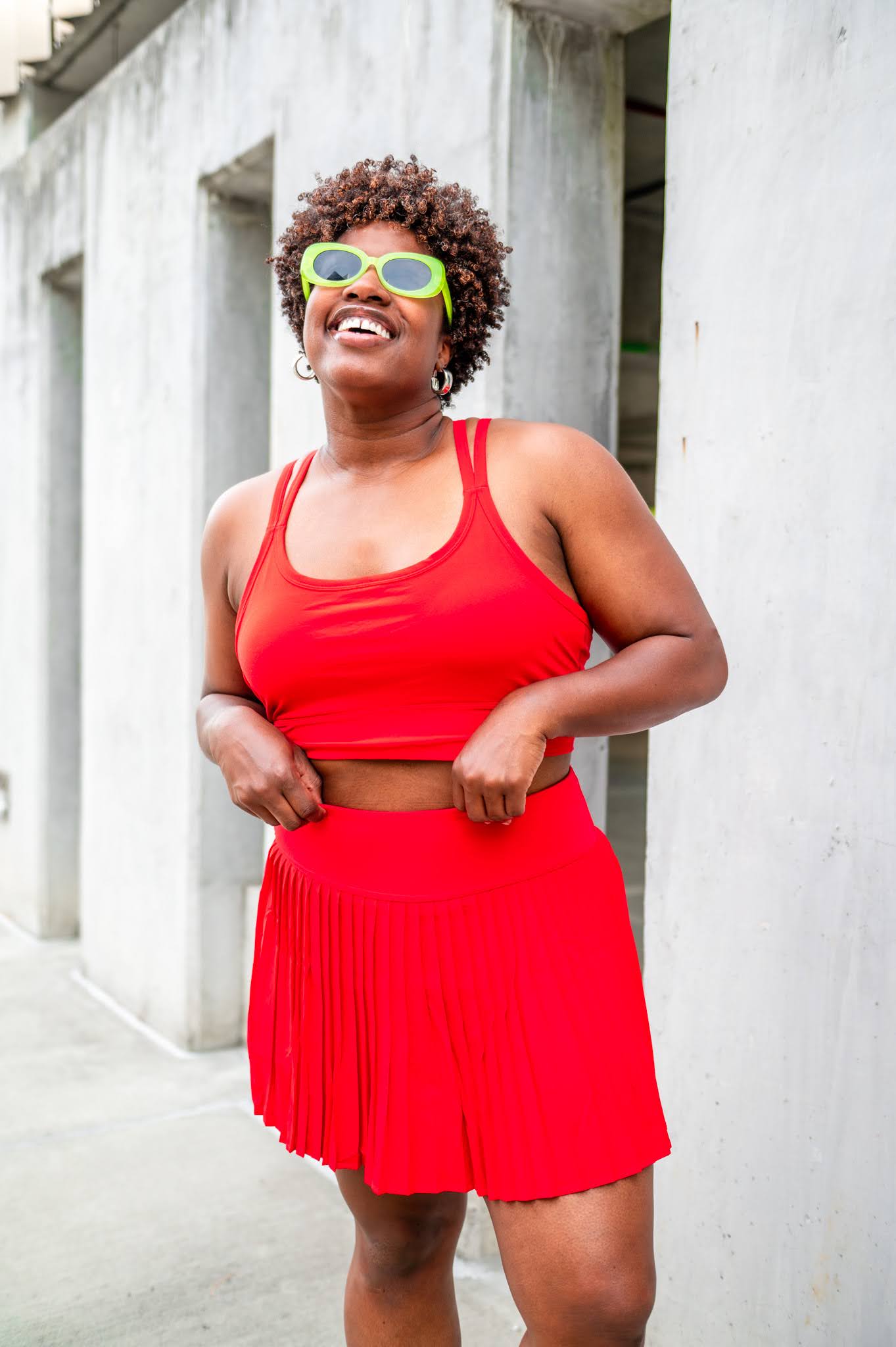
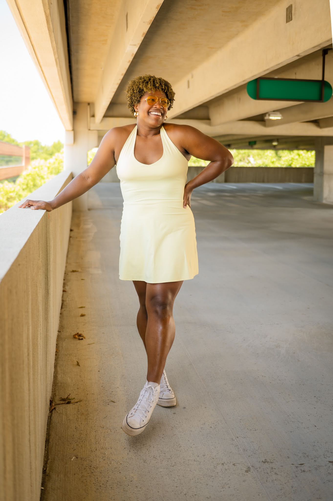
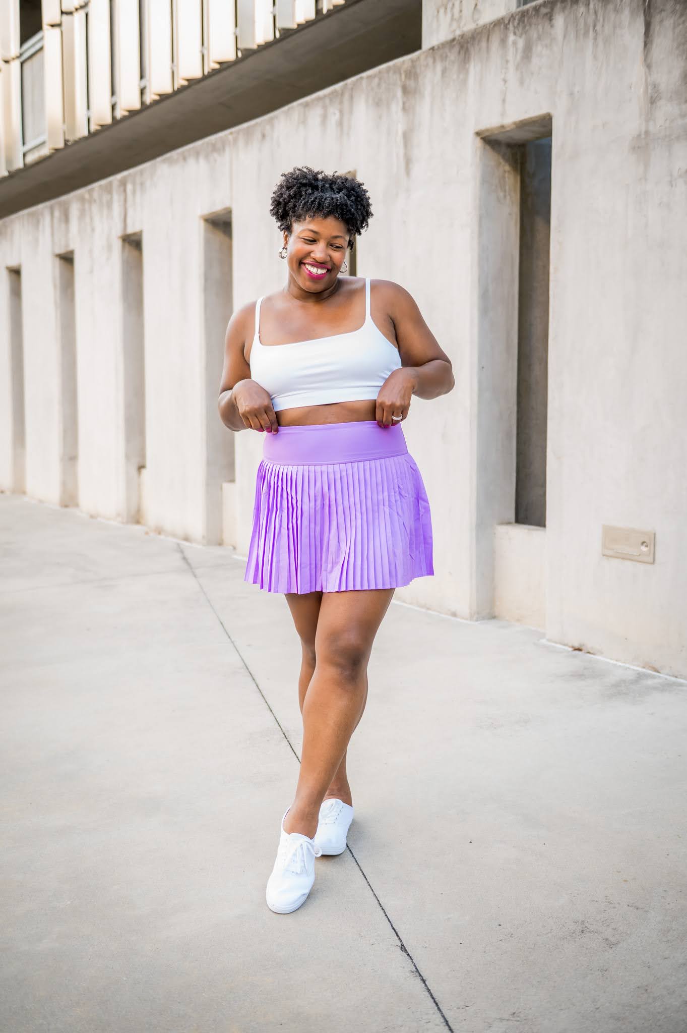
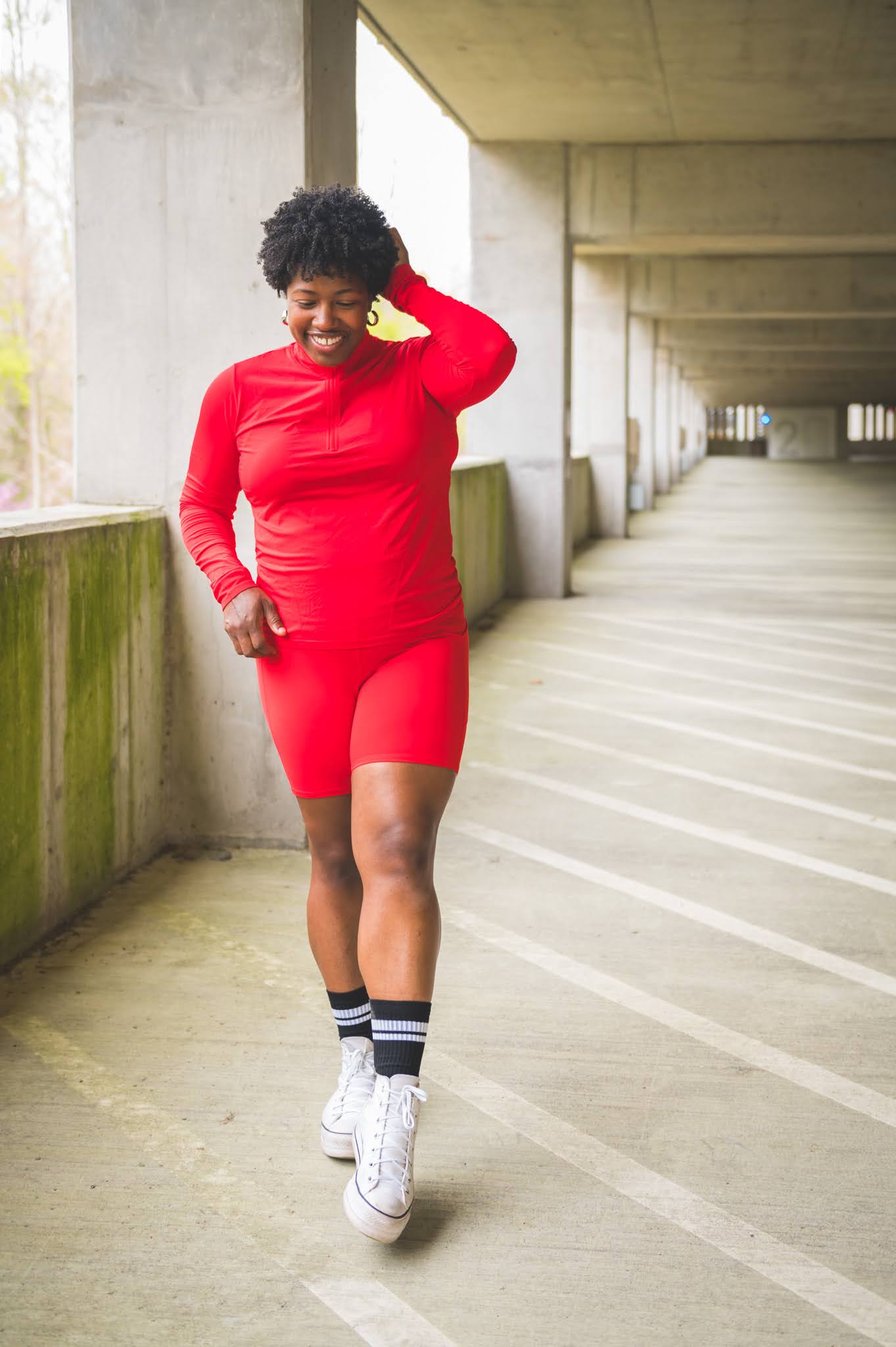
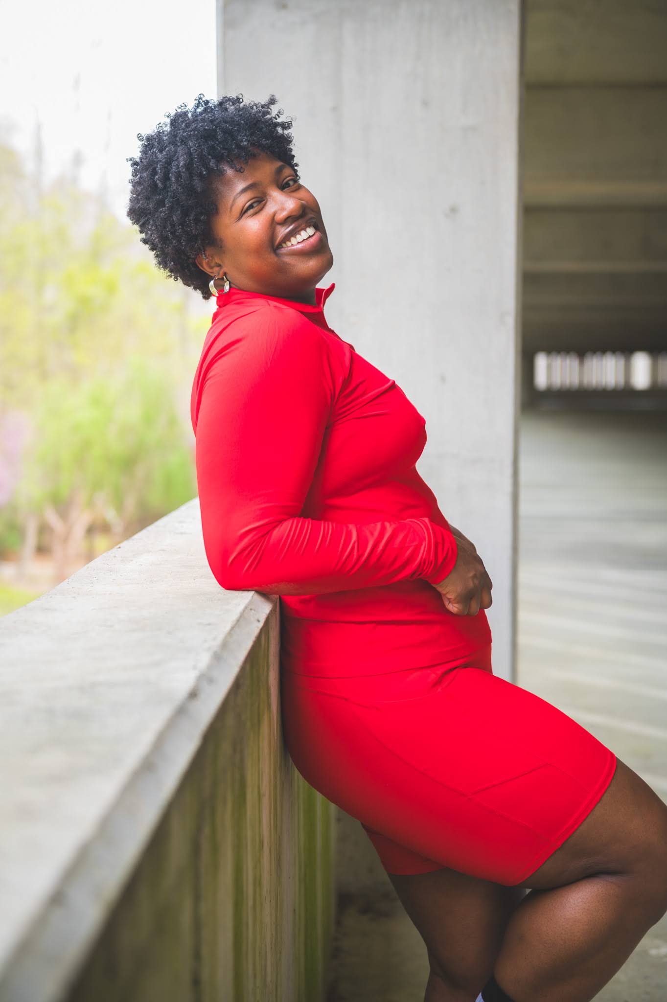
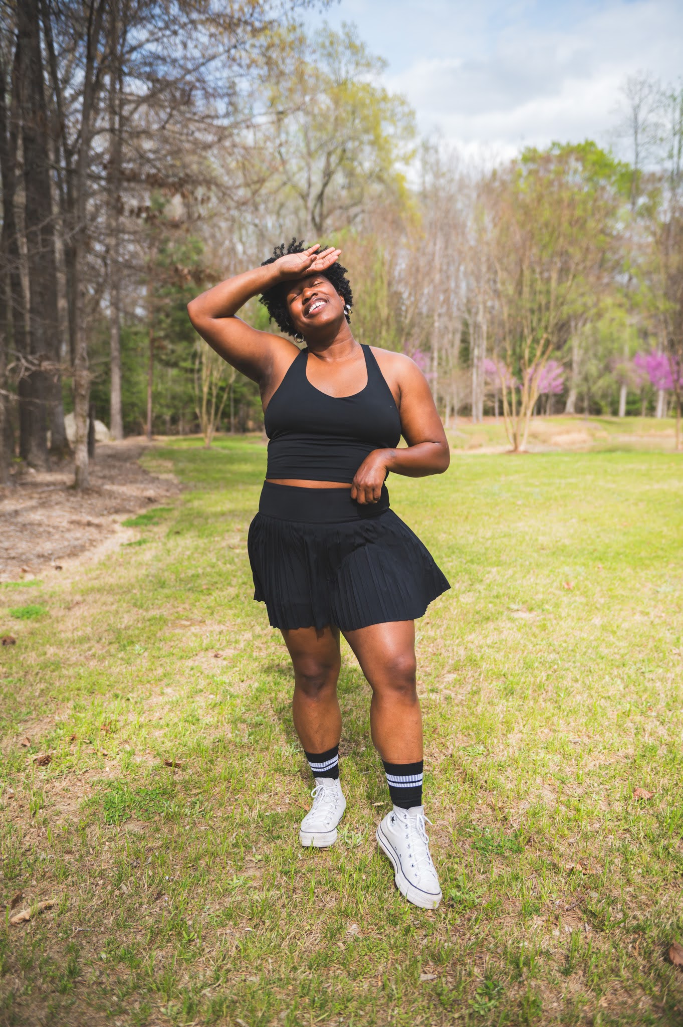
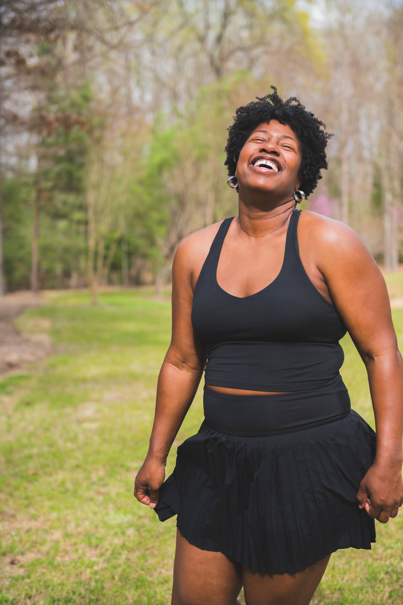
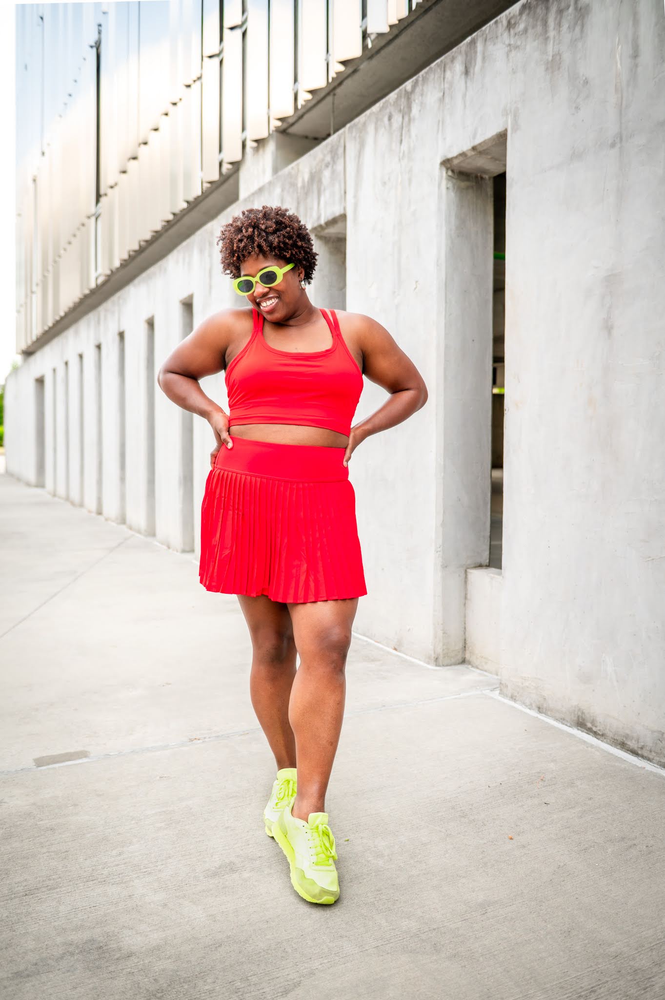
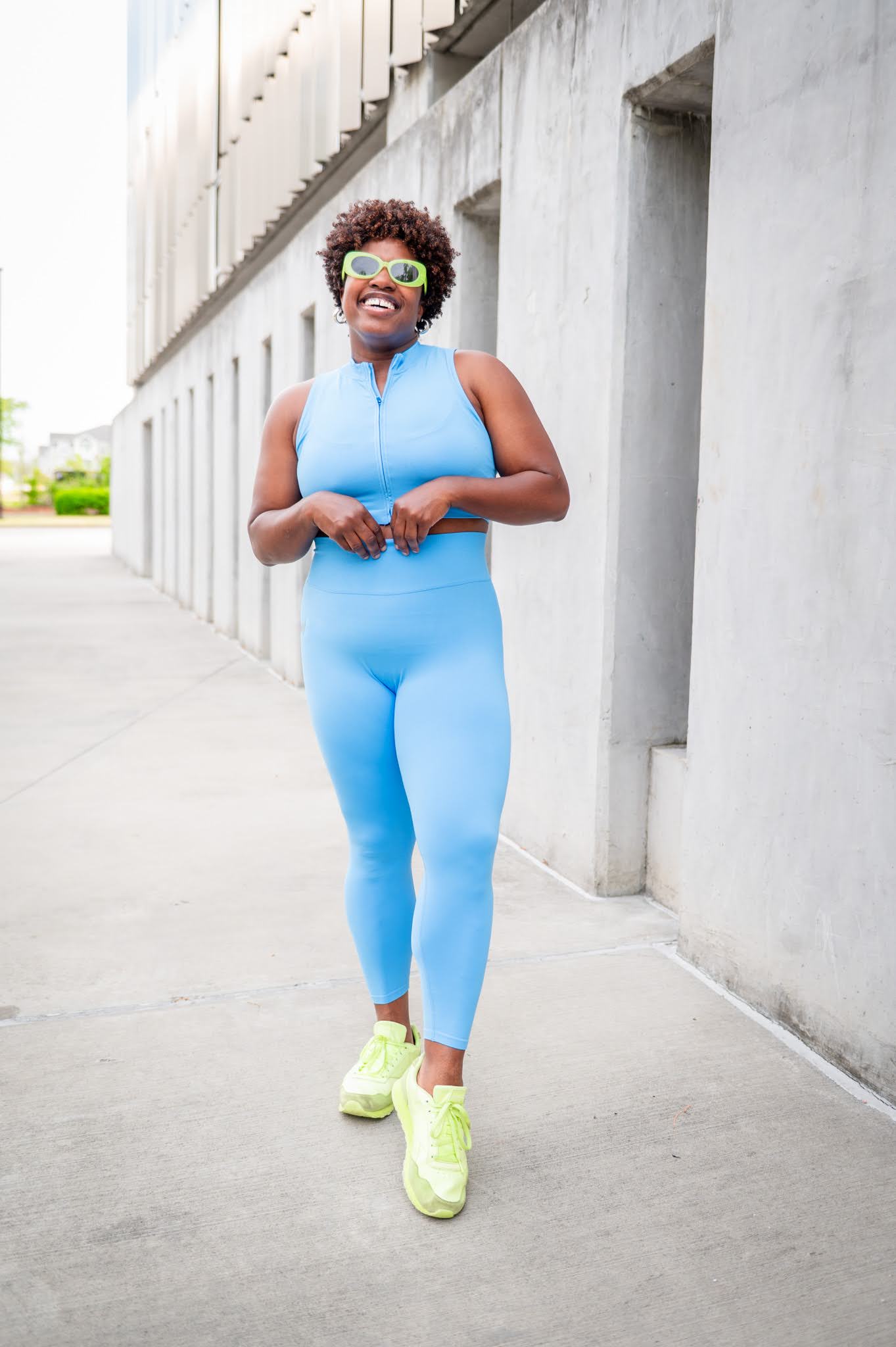
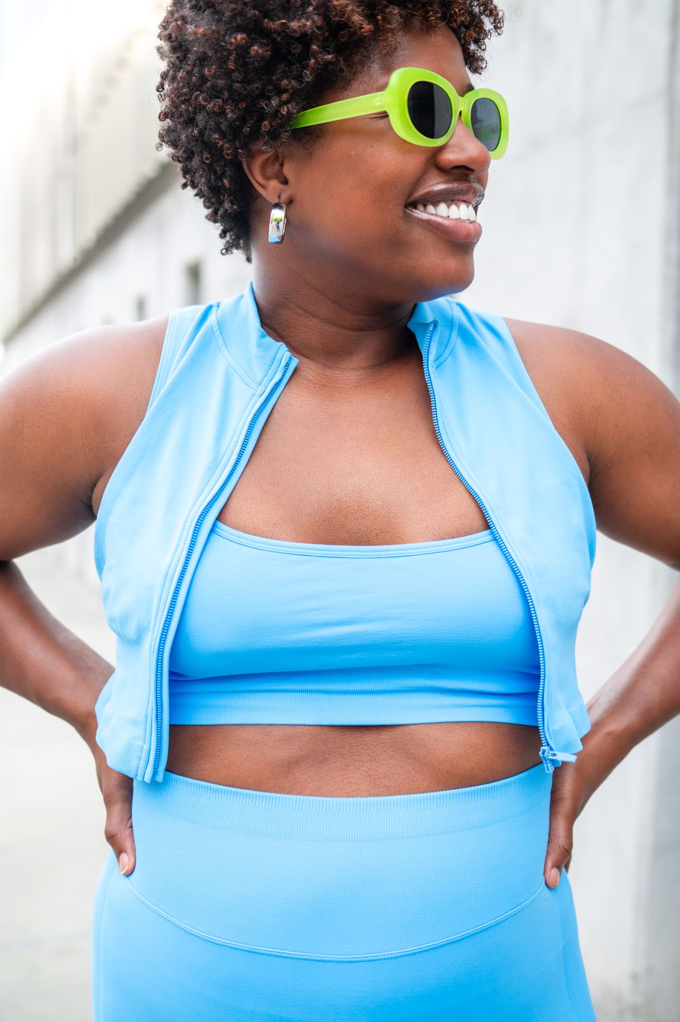
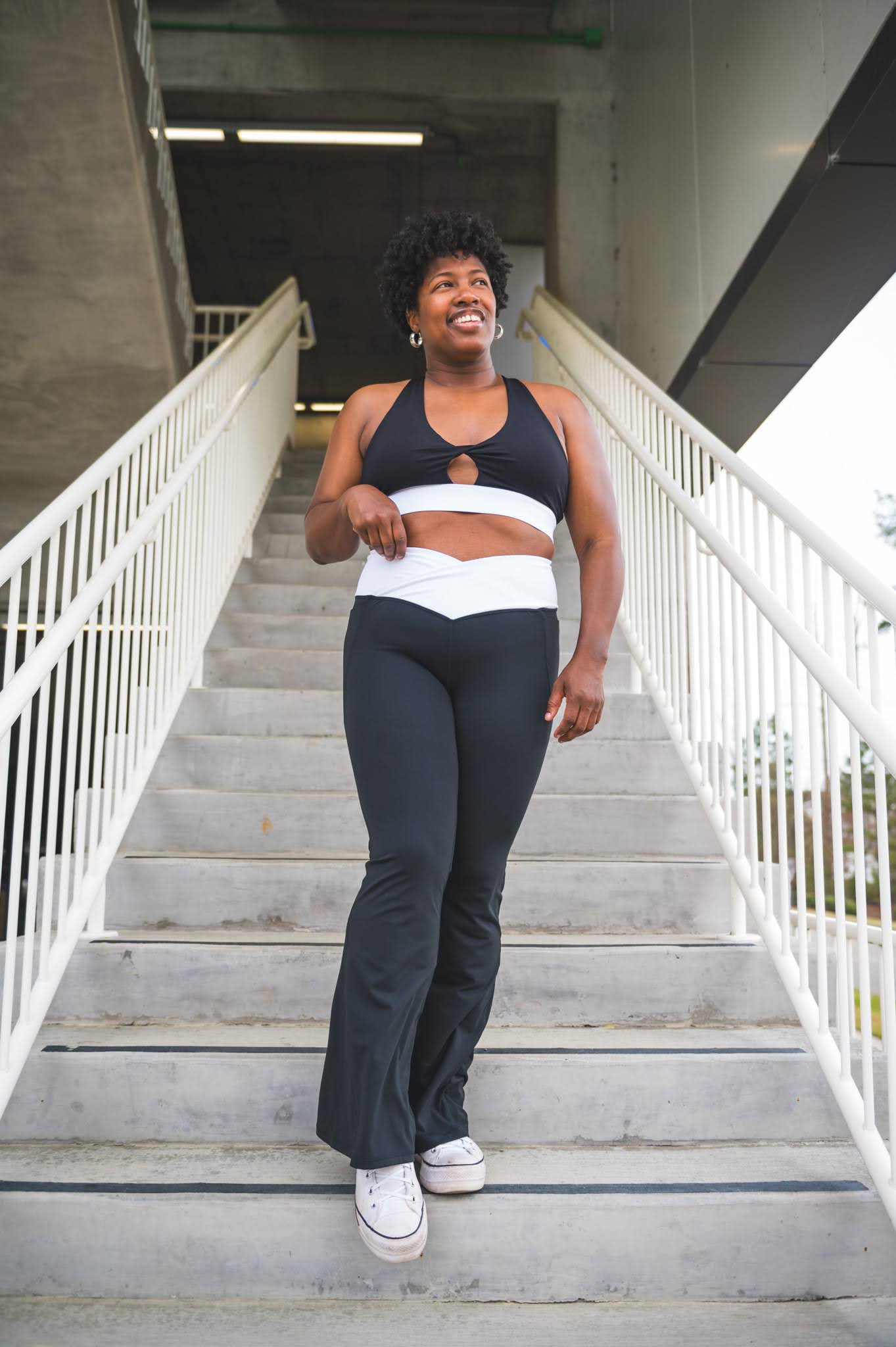
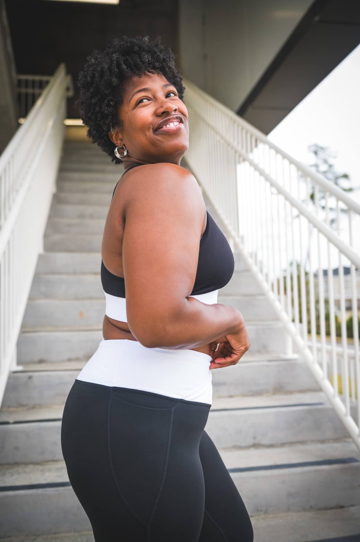
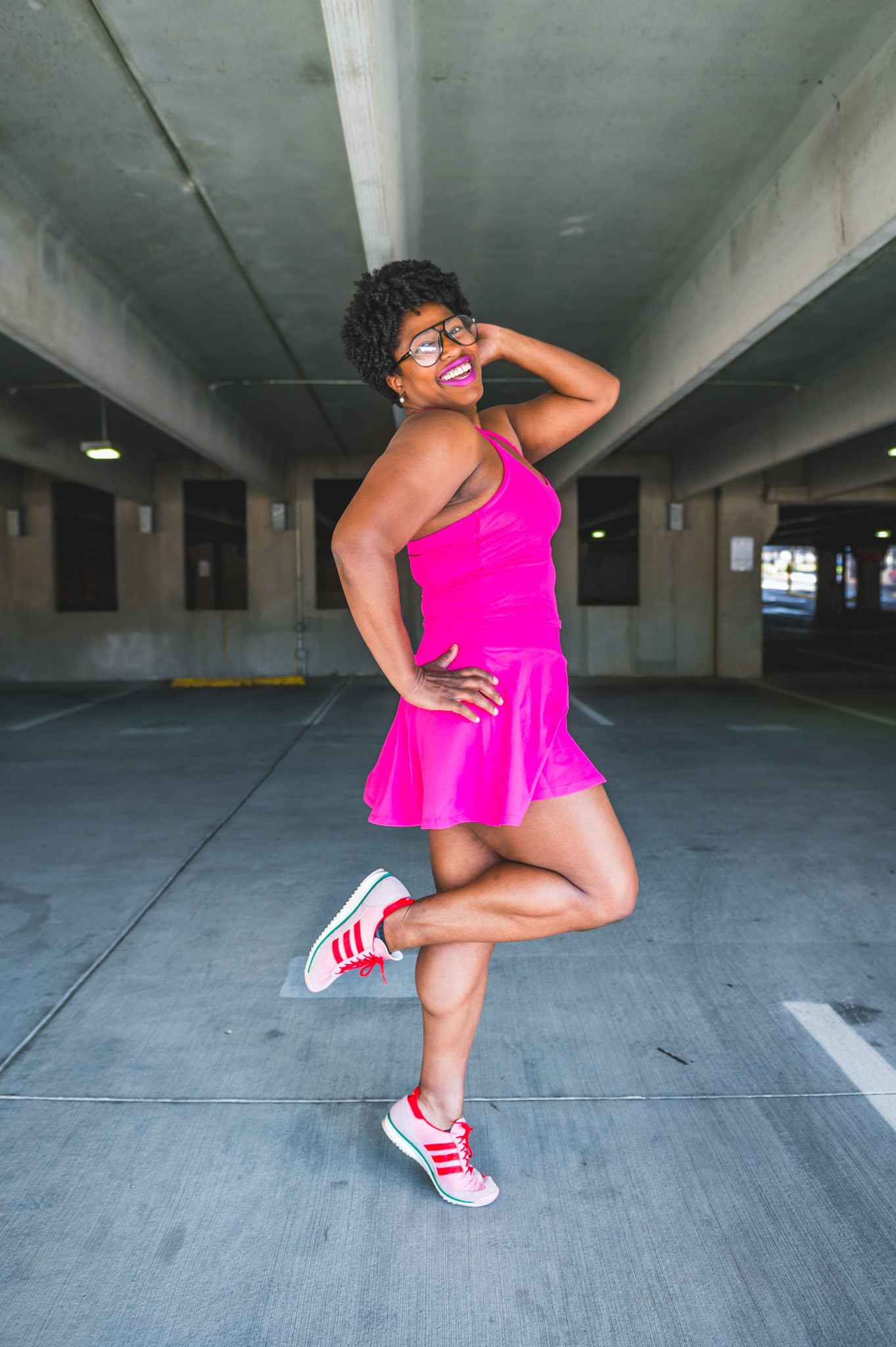
Since having kids, I basically live in athleisure wear. This is my story, this is my song. With all that in mind, I try to make sure it’s at least cute athleisure wear. It’s important to make sure it’s colorful as well if you ask me. Life is way too short for boring athleisure wear.
All that said, here’s a round up of my faves from this Spring and Summer.
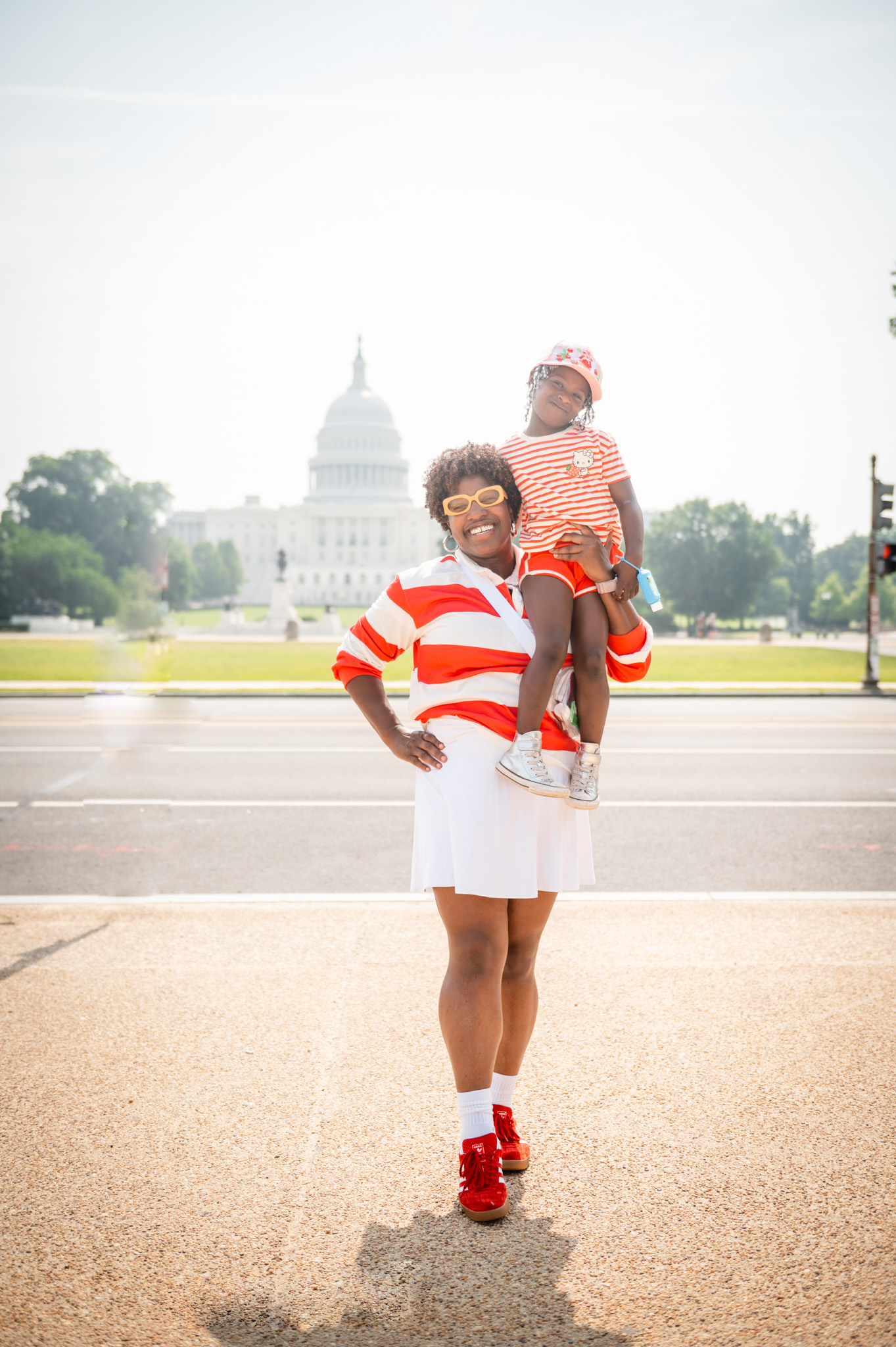
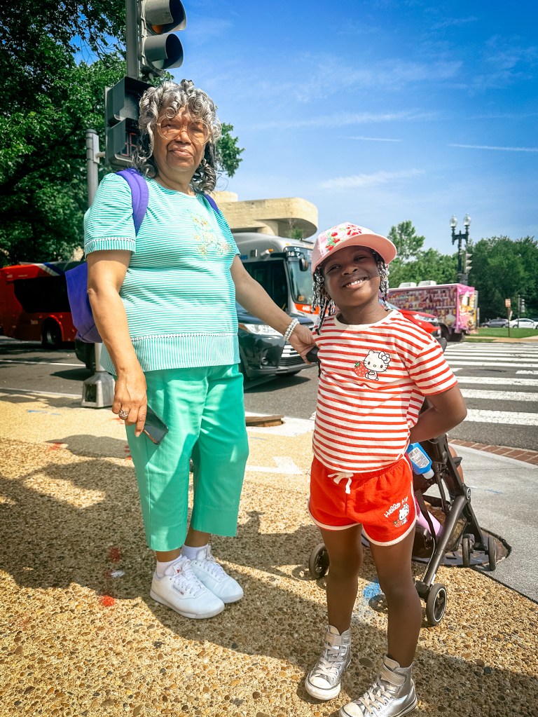
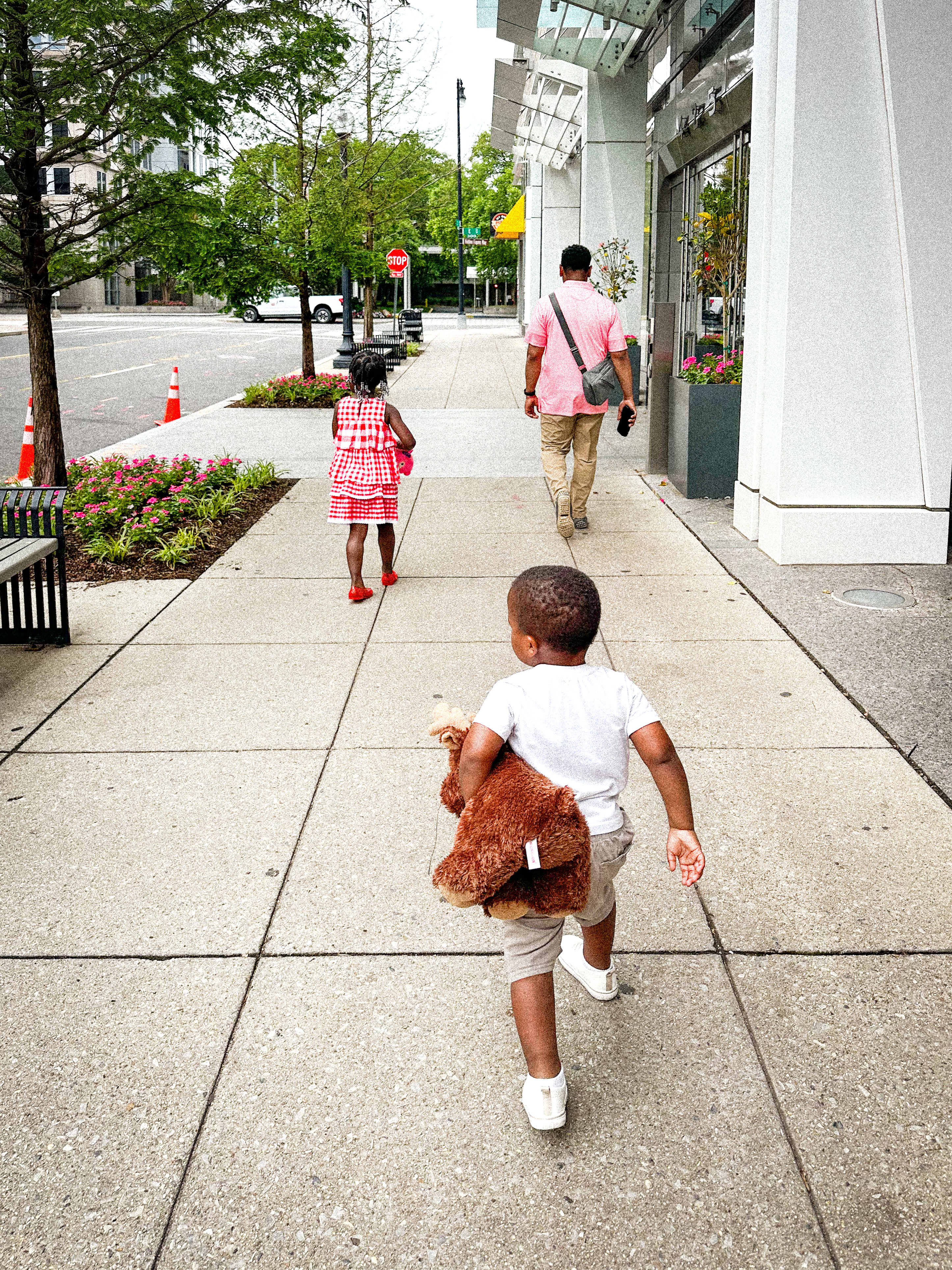
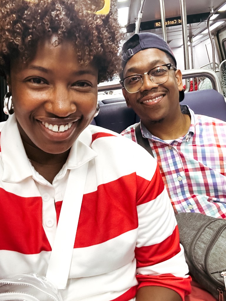
Let me start off this post by saying, traveling with toddlers is HARD! Nobody warned me, lol. Charles and I questioned every bit of this trip. Was it the best idea, no, did we regret every minute of it, YES, were my kids happy, big YES. There were a lot of things at play that made this one of the worst trips I’ve ever been on.
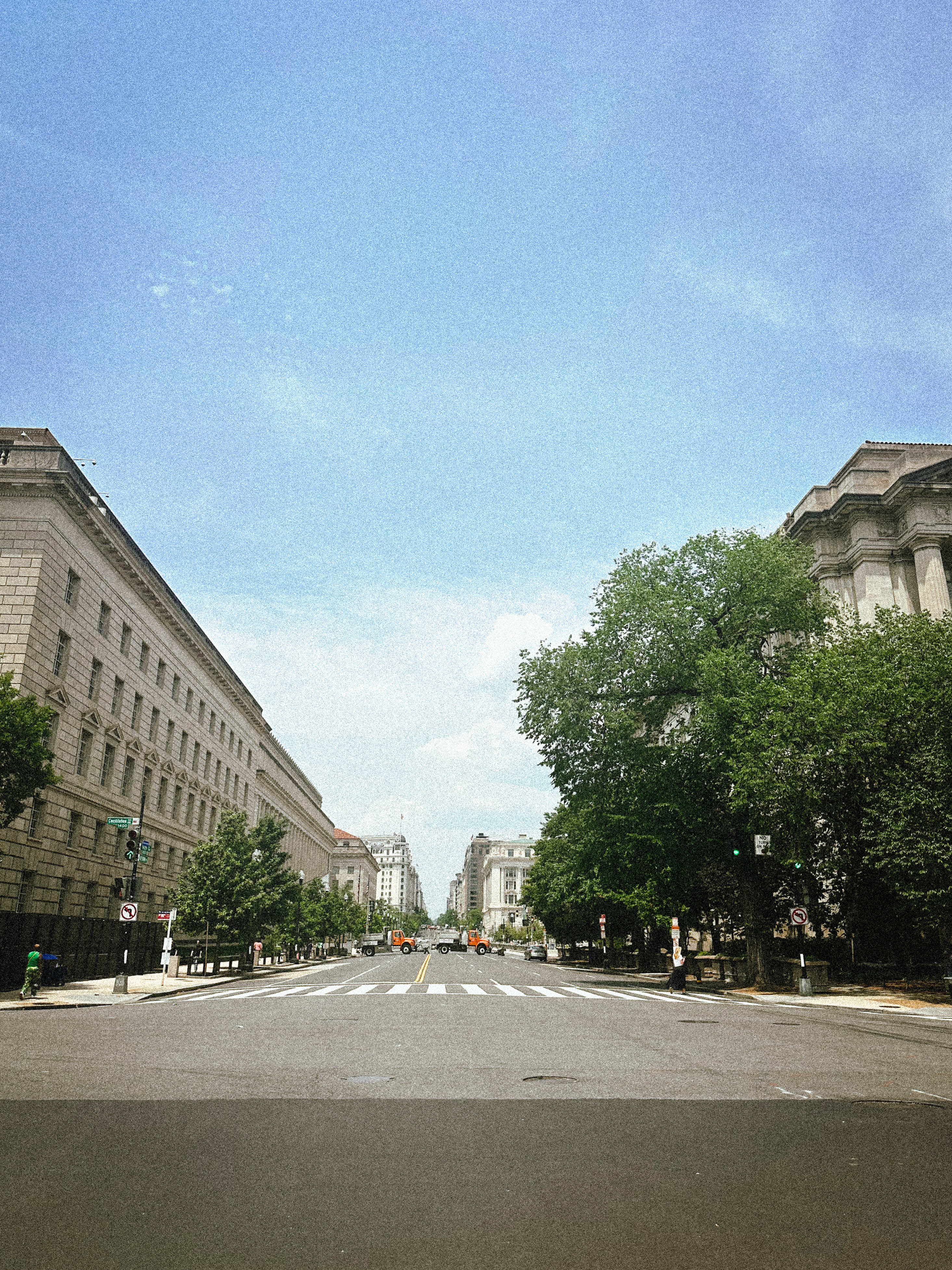
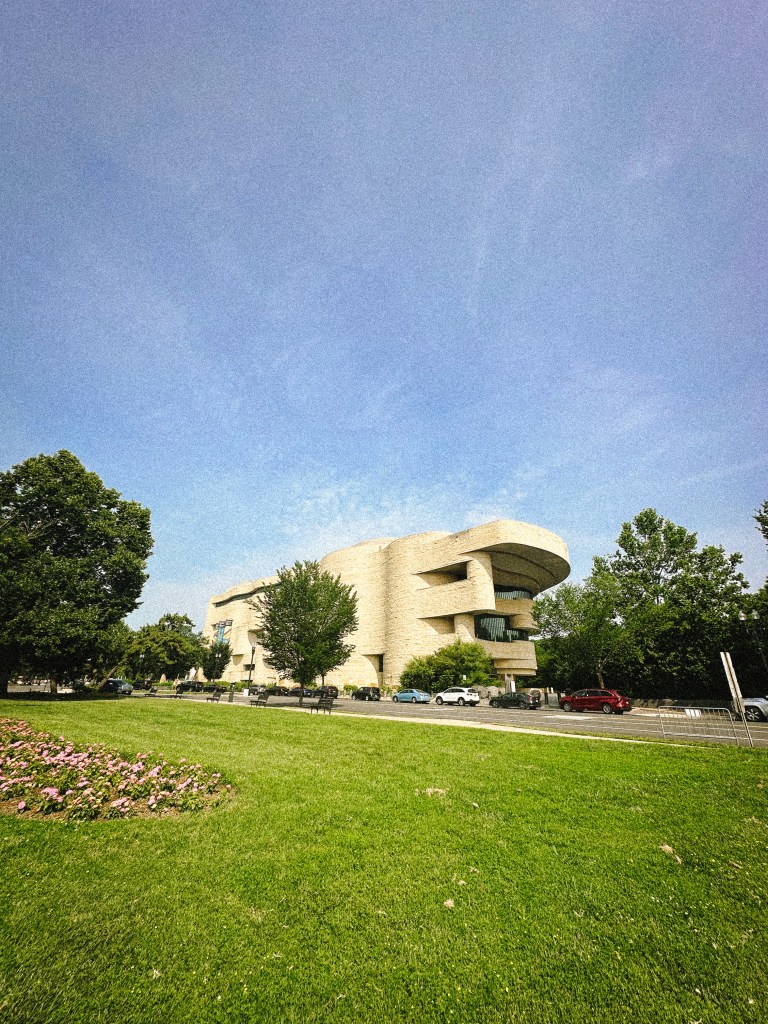
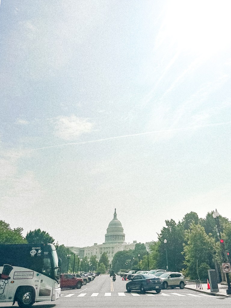
Most of D.C. was blocked off for celebrations and activities happening that weekend. My husband had planned this trip months ago. Only a week before did we discover all this stuff was happening the weekend we planned to go.
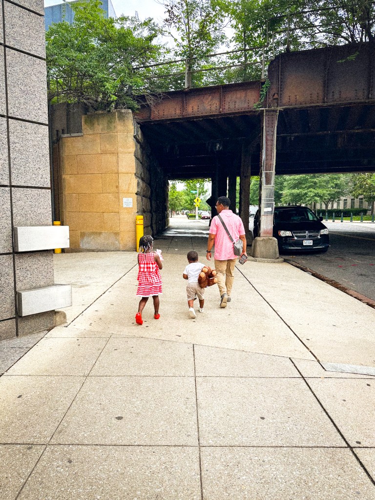
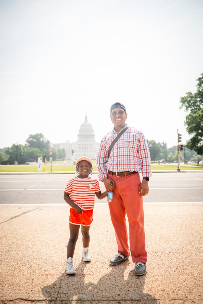
My son was a little under the weather. He was feeling okay, but not 100%. Needless to say, he was a bit whiny and over the heat, which is definitely not his baseline. He’s a chill kiddo. Still, he was slightly sick. Walking the city in the blazing heat, he was just over it.
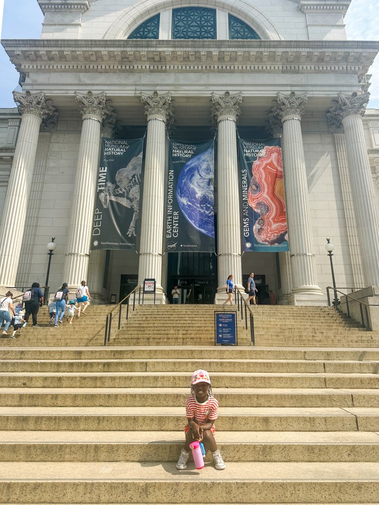
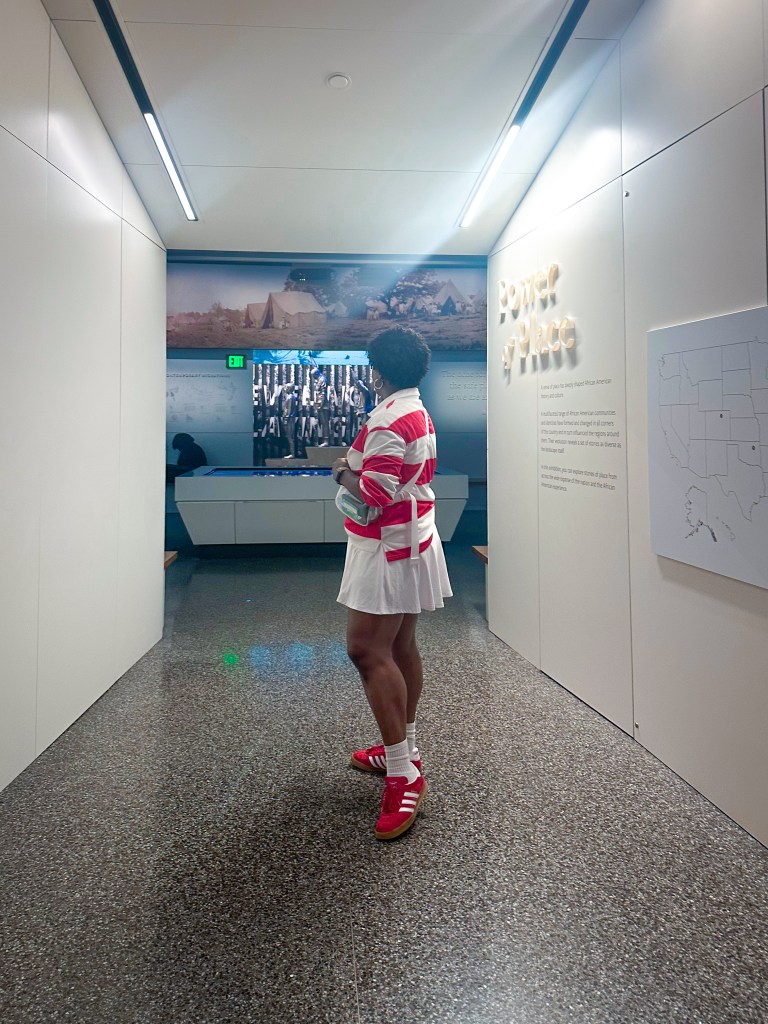
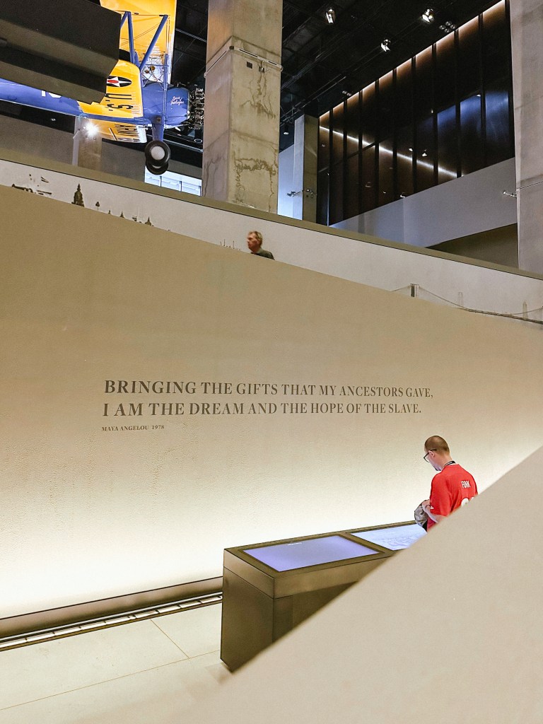
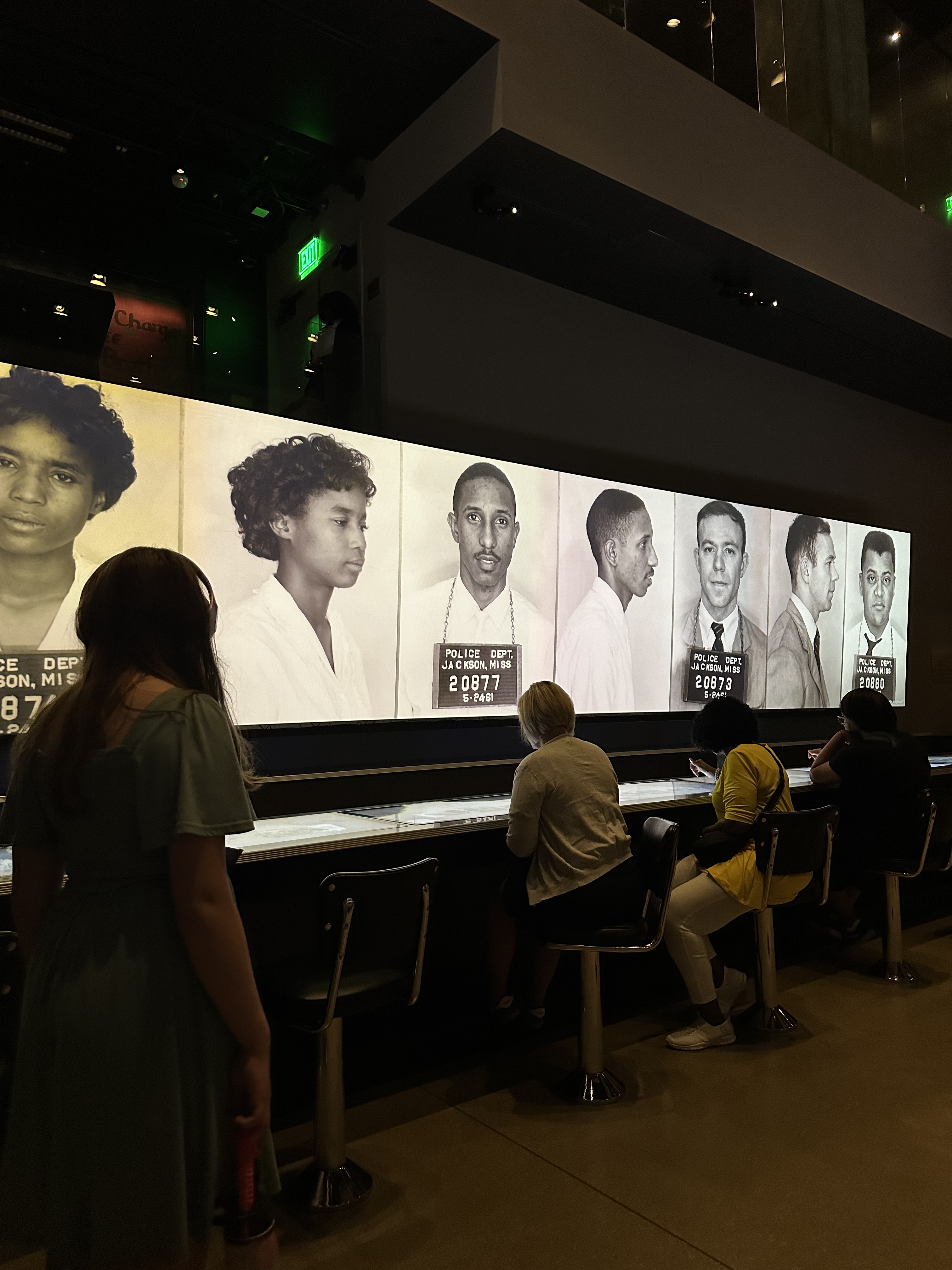
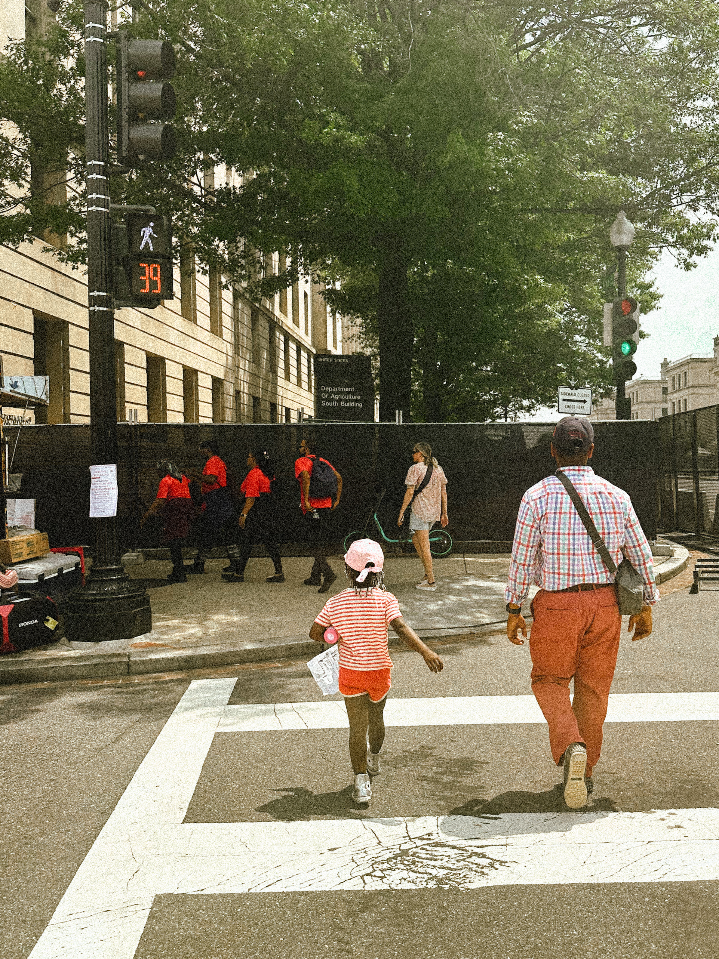
Speaking of heat, it was HOT!!! I mean, it’s June, it’s to be expected. But, the streets were blocked off and there were no Uber’s in sight, we had a challenge. We had to walk over a mile in high sun to get to our destination, the museum.
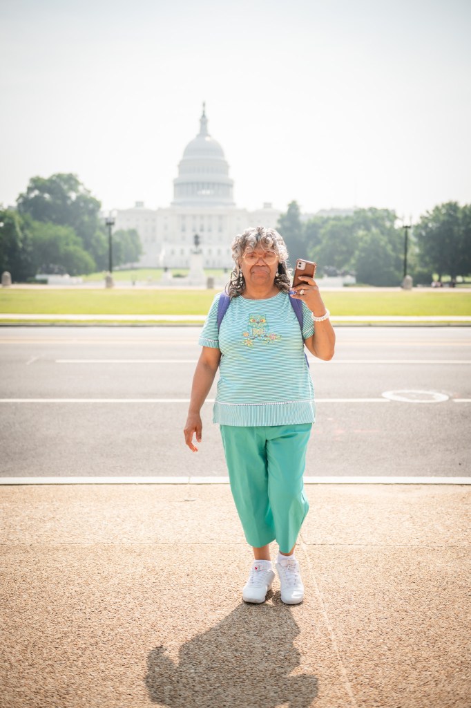
My mother-in law and aunt in-law traveled with us. They are awesome, but old school and prone to unsolicited parenting advice. Moms who know what I’m talking about understand exactly where I’m going with this.
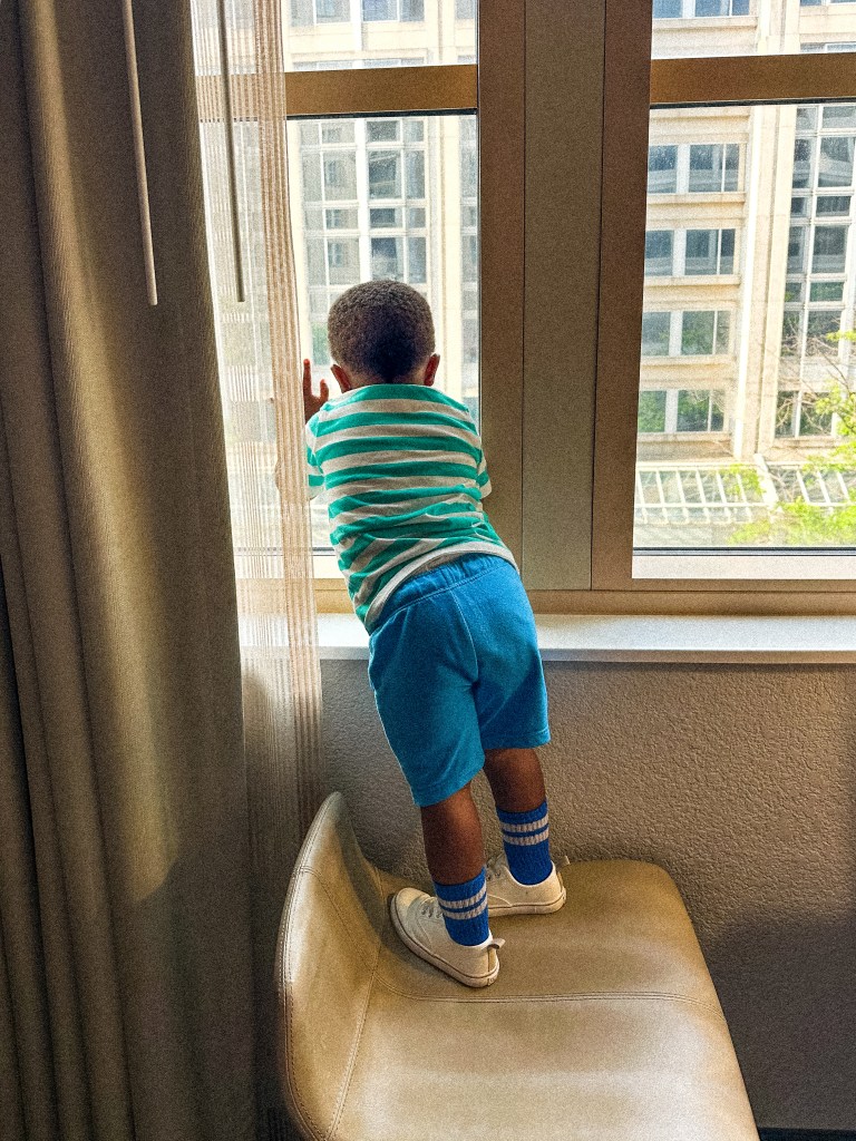
The hotel wasn’t that great. The AC was broke. This made the rooms and lobby area humid and muggy. Our television wouldn’t turn off either. Maintenance came 3 times to figure out what was going on. They only told us it would have to get unplugged for the duration of our stay.
Due to all the festivities in the city during our visit, most restaurants were closed. Others had odd hours. Note to self, help my husband plan the next trip, LOL.
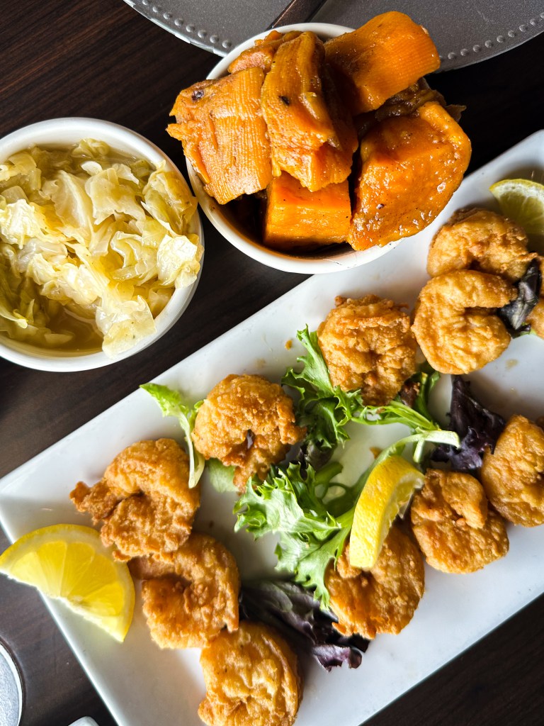
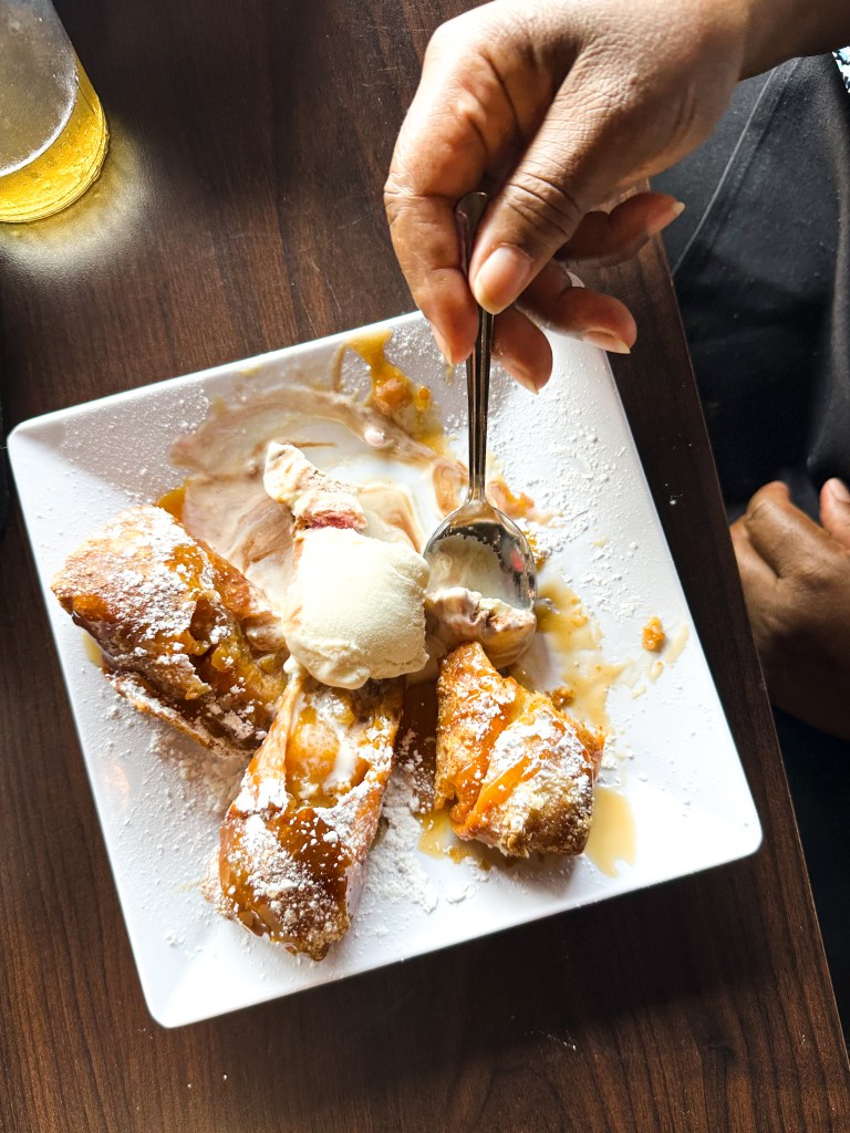
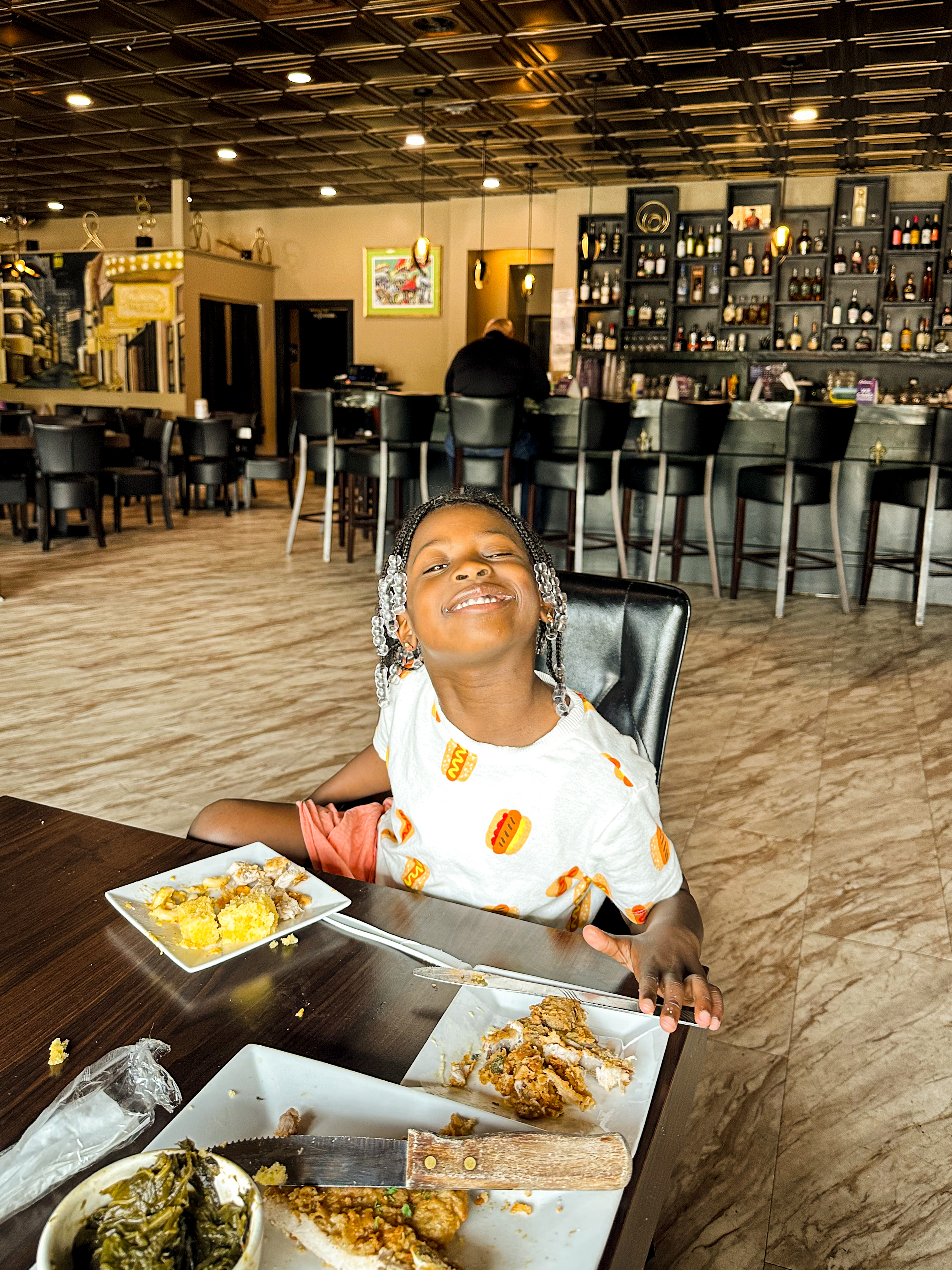
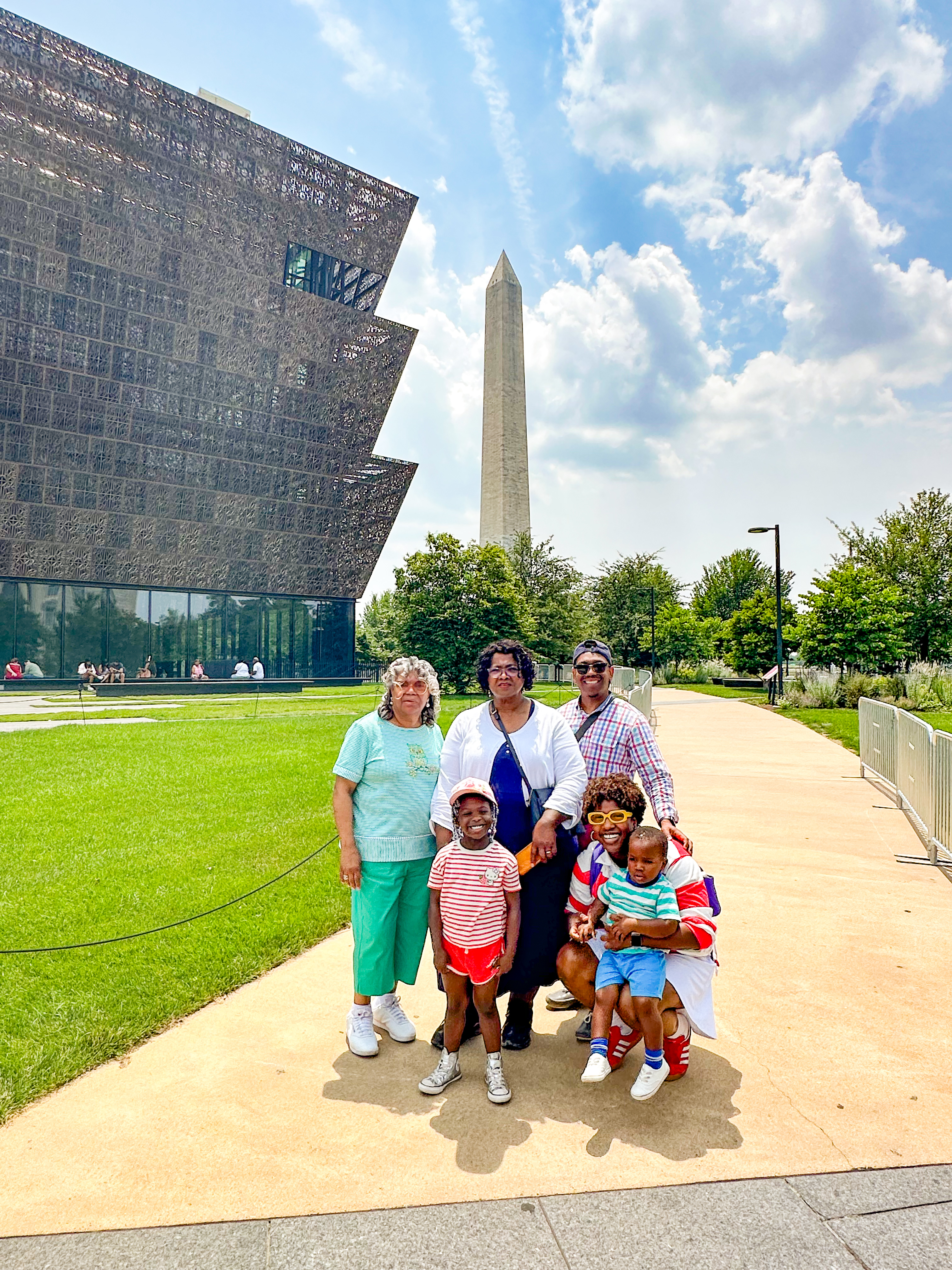
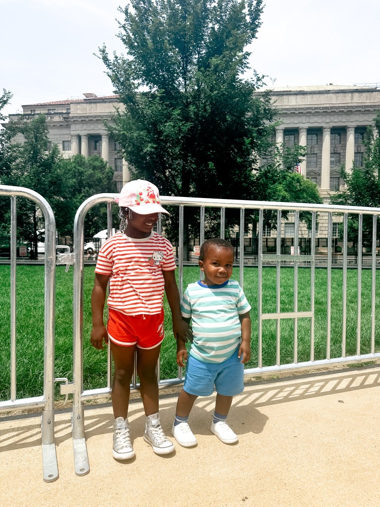
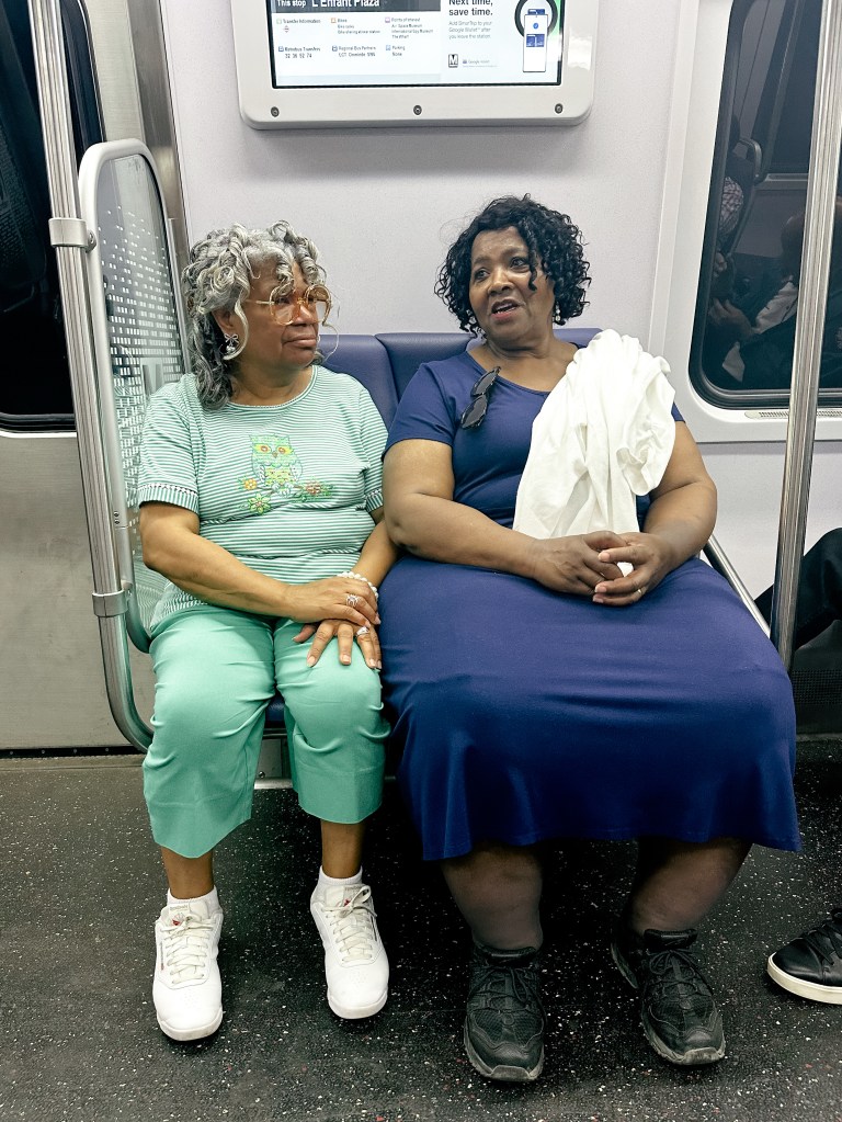
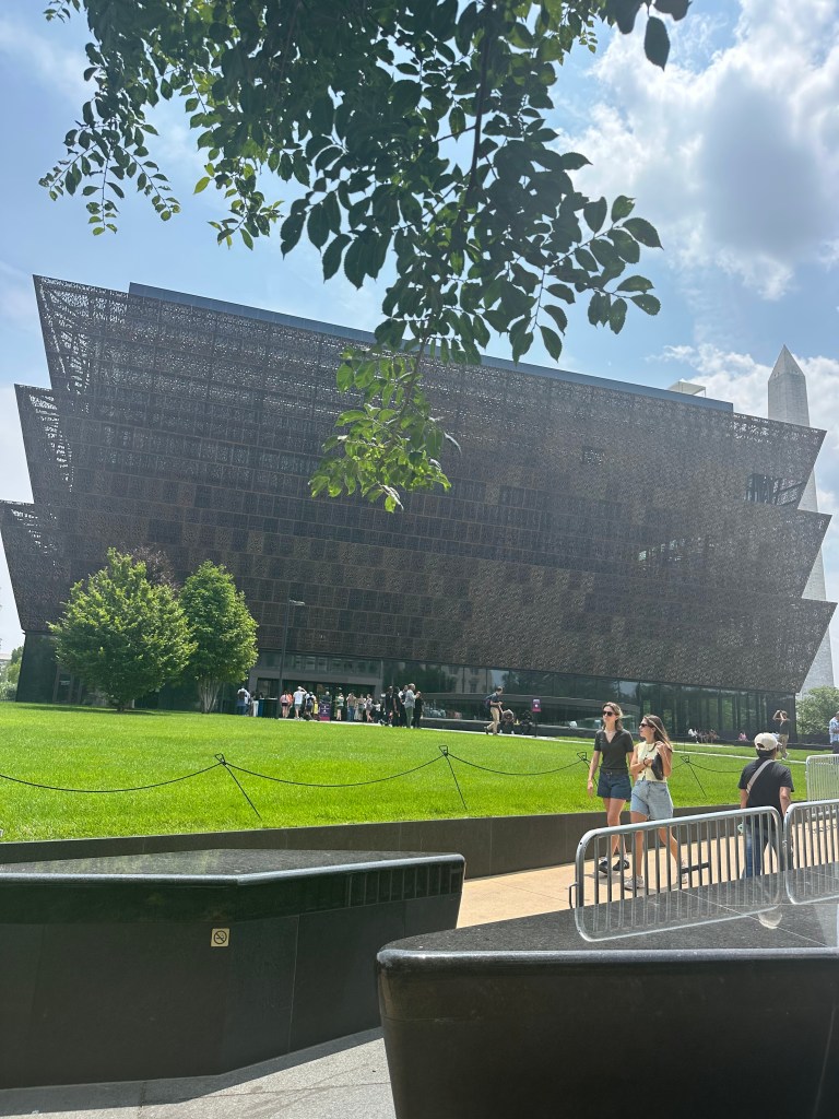
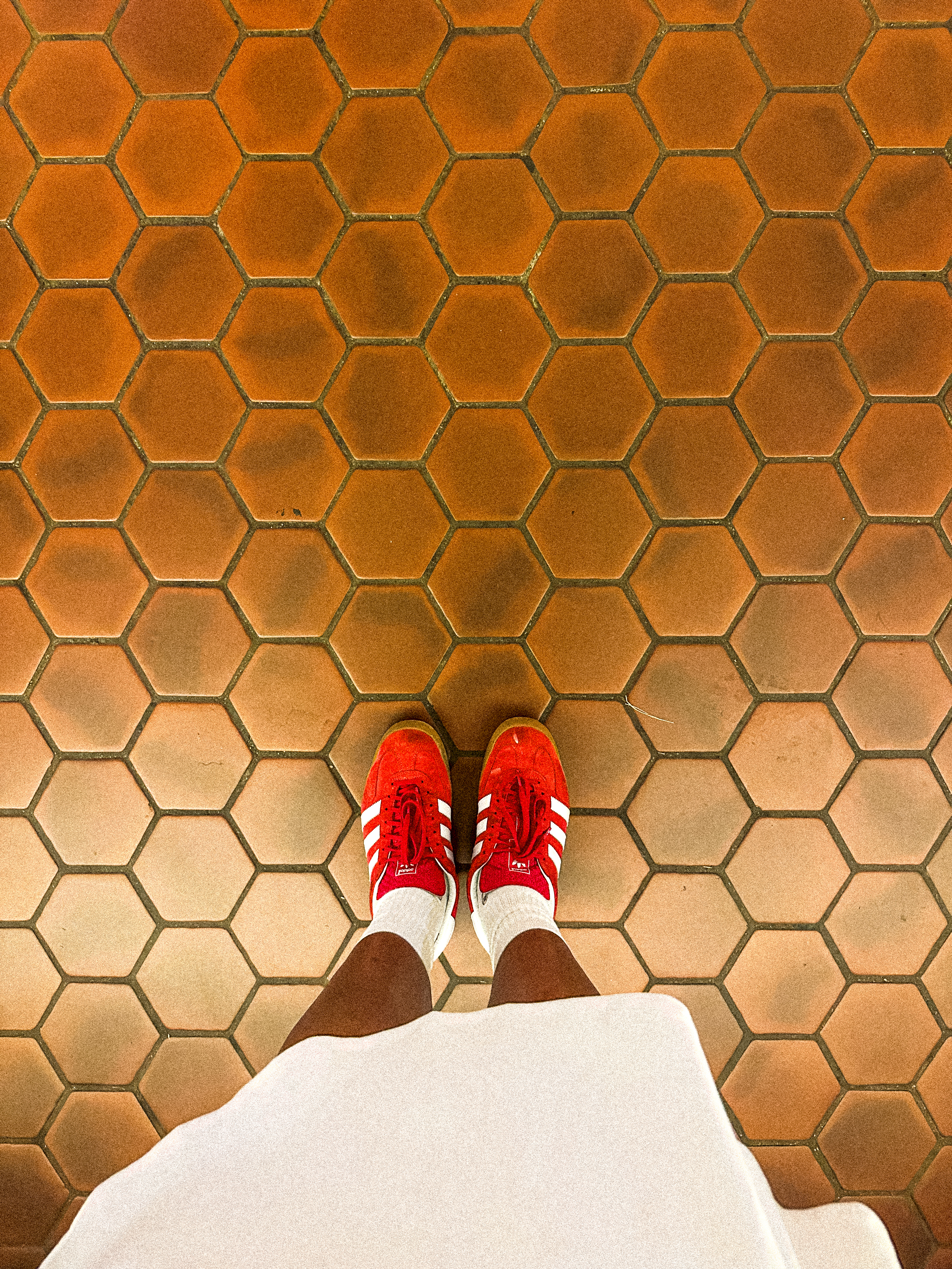
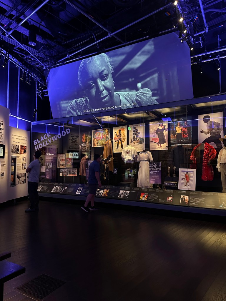
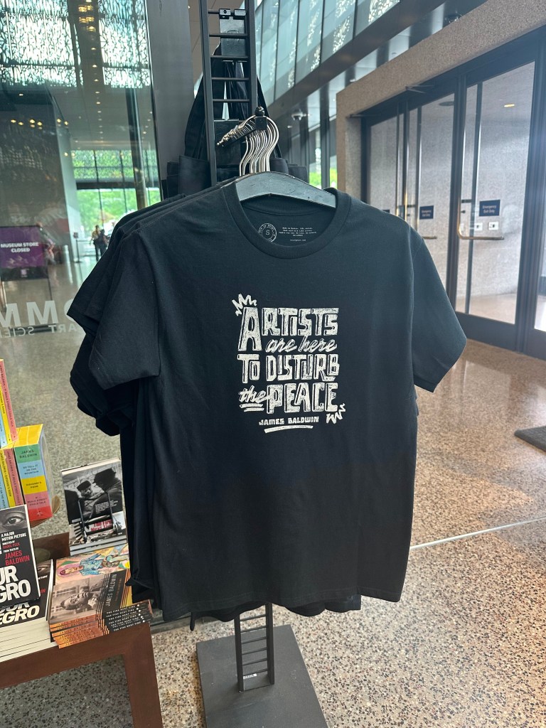
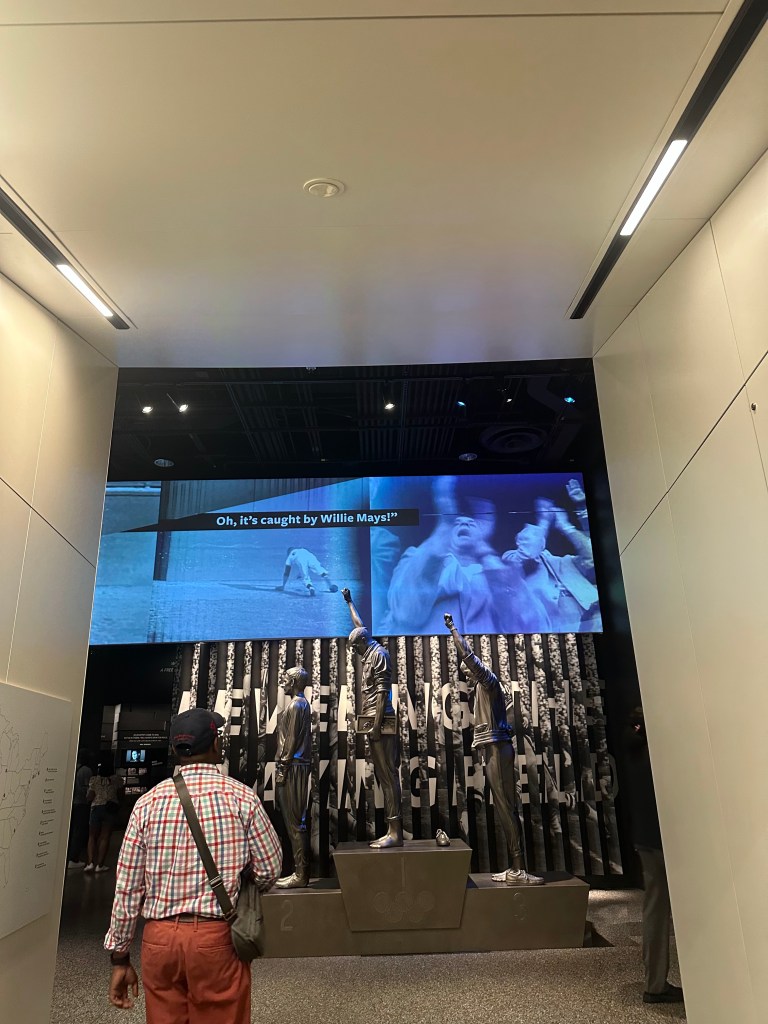
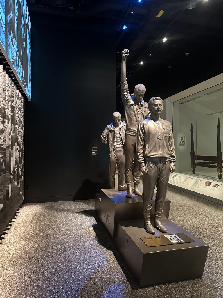
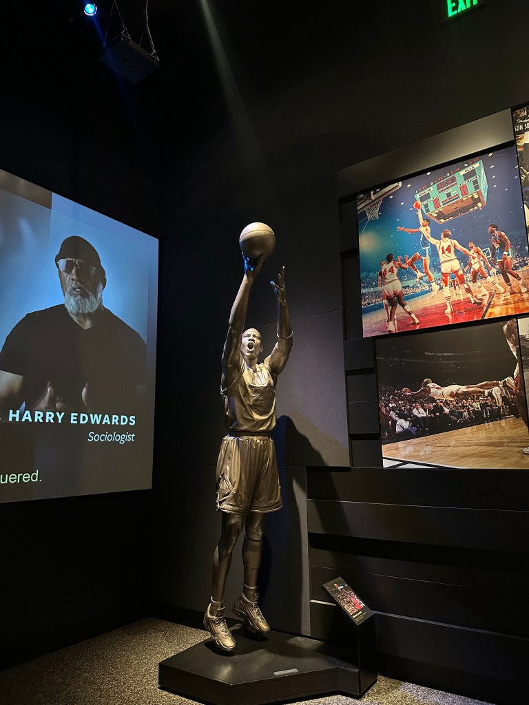
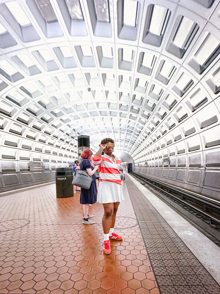
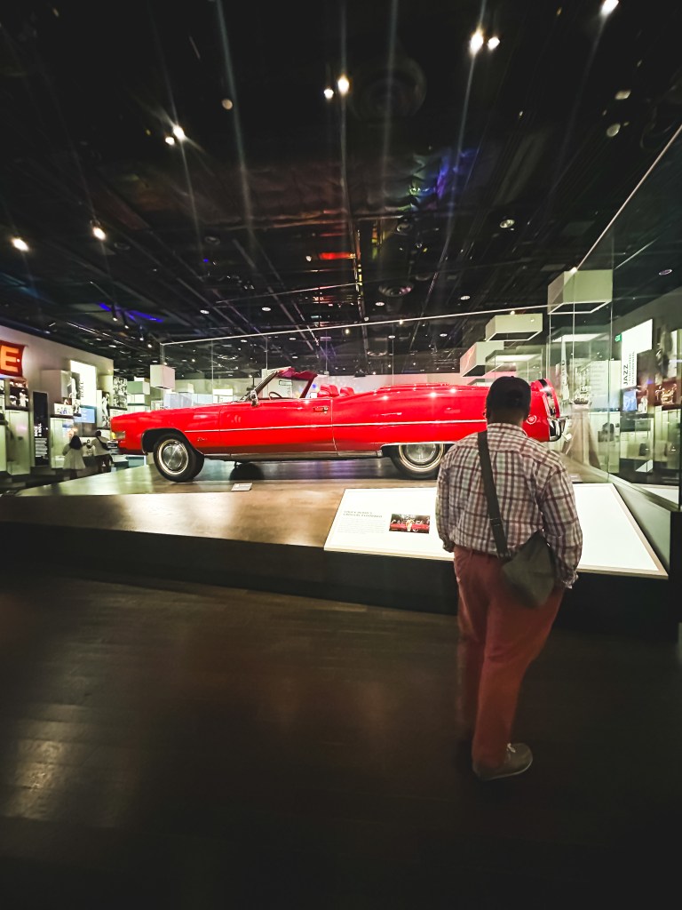
Even with all the messiness of this trip, there were some good moments to look back on. We visited a yummy restaurant right outside of D.C. called Orleans Bistro and Grillin Fredericksburg, VA. The food was amazing and definitely worth the visit if you’re local. I did snap some cool pics. My daughter was over the moon to have finally taken her first metro ride. My 70 year old aunt in-law challenged herself. She walked the full mile to the museum in the scorching hot sun, might I add. She was very proud to have done this. I was proud of her for sure! Charles and I got a chance to explore the city ourselves for a few hours too. We went back to the museum and almost made it through the whole building. We said we’d come back just us one day. This was my second time in D.C. and there is still so much I haven’t done. All that said, there were certainly moments of joy for sure.
Here are some snaps I captured. They will definitely be filed away under “I’m hot, I’m tired, I’m over it, but the kids are happy so it doesn’t matter” album.