
What better way to prep for spring than with a color consultation. Keep reading to see what I’m talking about. A few months back I had the pleasure of working with the amazing Created Colorful team to figure out my best colors.
What is Created Colorful?
Created Colorful is a team of amazing color experts devoted to helping you find your best colors. They are there to help you unlock the many possibilities you have with your wardrobe and help you learn to choose clothing in colors that highlight your best features. The brains behind this whole operation, the beautiful Lindsey, Owner of Created Colorful, set-up an amazing color consultation for me so that her team of trained experts could find my best colors.
Initially, when the Created Colorful team reached out regarding a consult, I was a bit hesitant. Passed experiences around make-up and wardrobe styling had me thinking that a color consultation might be a flop. I had my make-up done before by people who didn’t really understand choosing the right colors for my skin type. I’ve sat in the chairs of experienced make-up artists who didn’t have my foundation shade or didn’t quite know what lipstick colors would look best on me. I’ve been sent clothing items from brands in colors that I felt really didn’t bring out my best features. Needless to say, as a woman of color, I’ve trained myself to always come with a plan B in situations that involve wardrobe styling, make-up and hair. I’ve trained myself to never assume people know how to style women of color, curvy women, and in my case, dark-skinned women. I’ve trained myself to believe that not every space is created for me and therefore, I have to create that space for myself and hope that with time, others will be able to see the need for inclusive practices, but with everything I do, I try to step out on faith and decided to give the Created Colorful color analysis a shot. FYI, this was my first time doing a color consultation.
My Color Consult
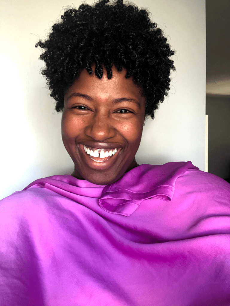
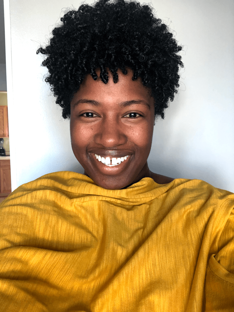
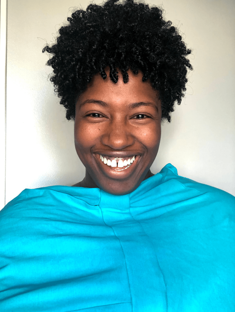
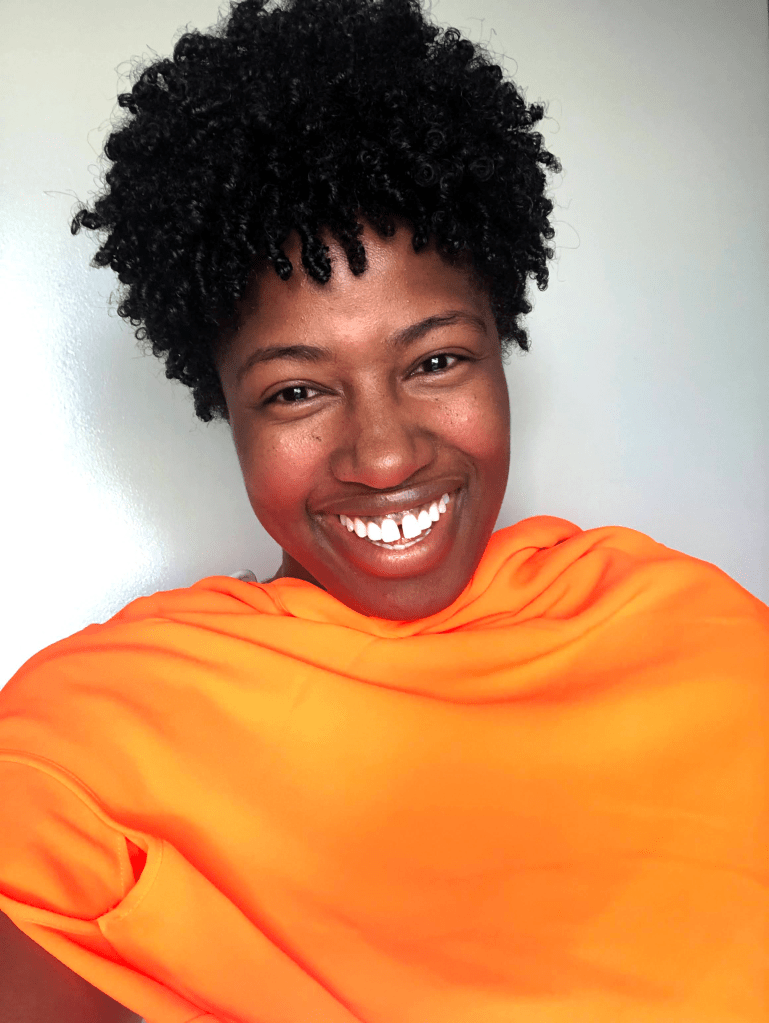
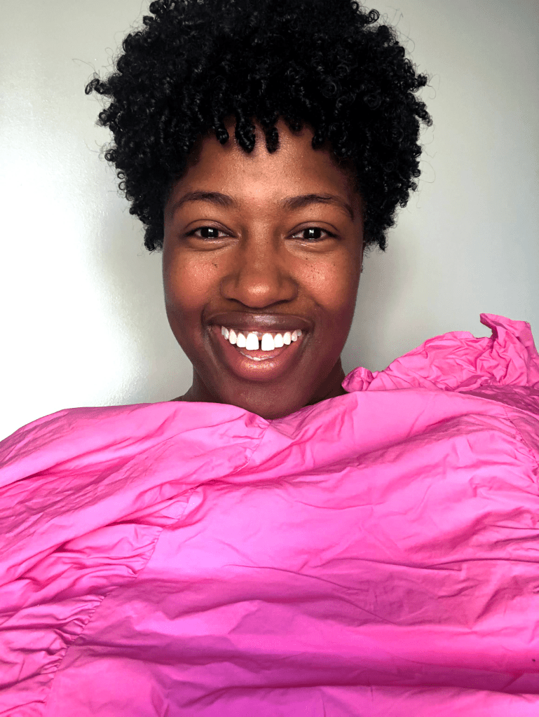
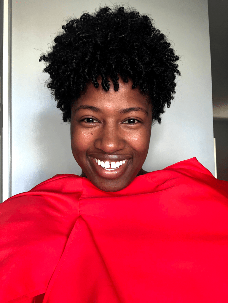
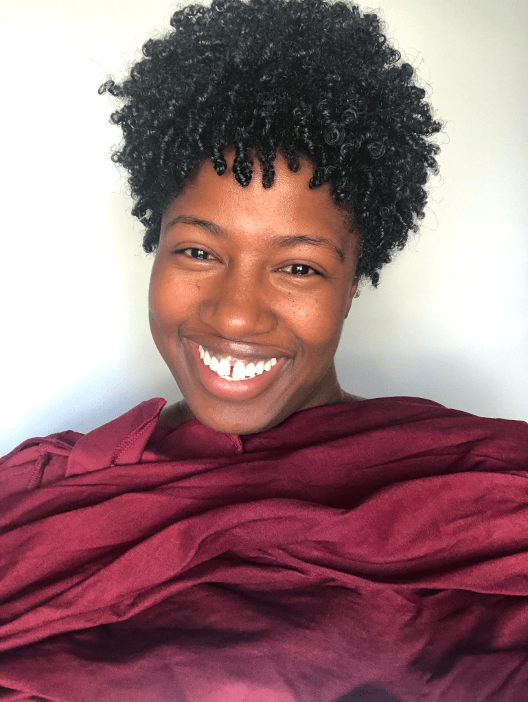
So, the first order of business was to complete a brief questionnaire. I was then asked to share several selfies with specific color fabrics draped over me . After those selfies were reviewed, I was asked to send just a few more colors to complete the full analysis. This part of the process was actually pretty fun because I got to dig through my closet and I discovered I had quite a few colors in my wardrobe. I think I was able to get almost the full list of colors they asked me to share, but they asked for a few more as well and after all my pics were sent in, it was time for the real magic to take place. I received a full analysis via email with kind words from Lindsey, the owner of Created Colorful. Additionally, I was given a full break down of my best colors, courtesy of my assigned color consultant, Tressie.
And the results are in … <<<drumroll>>>
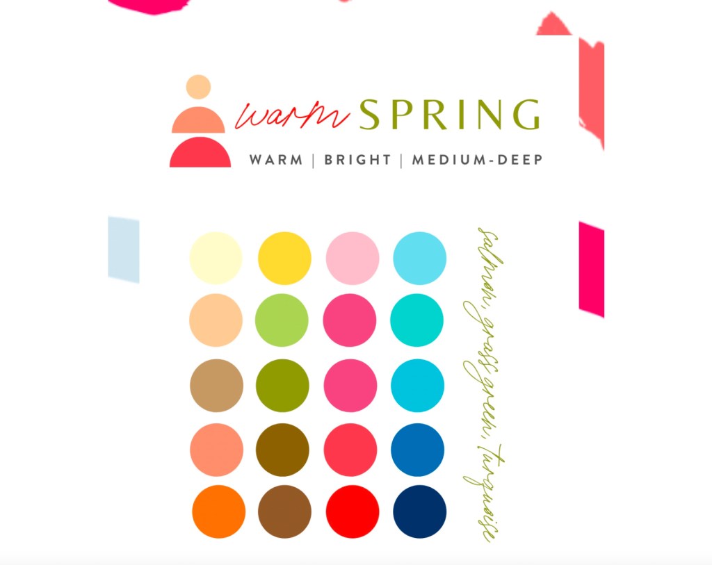
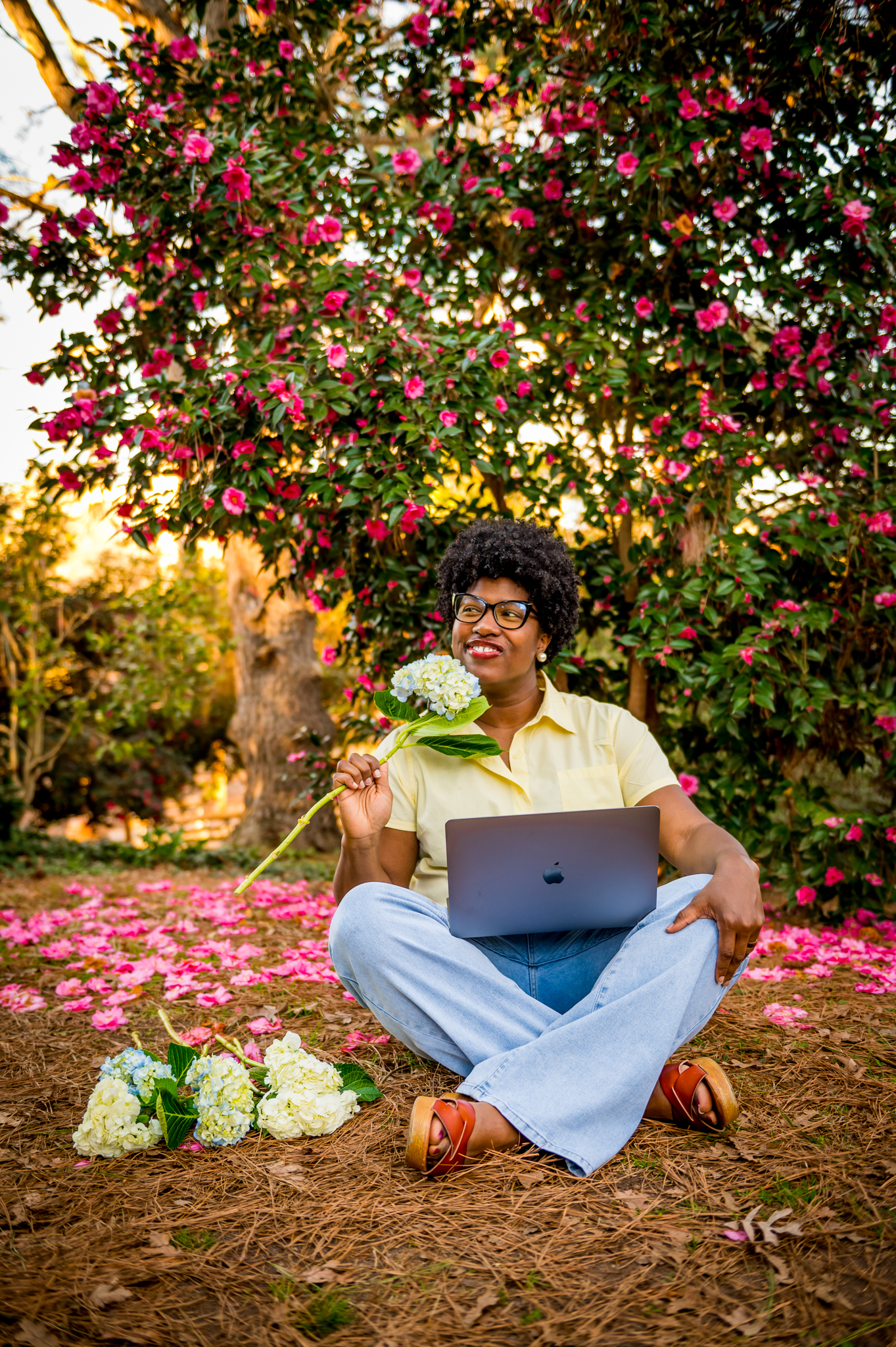
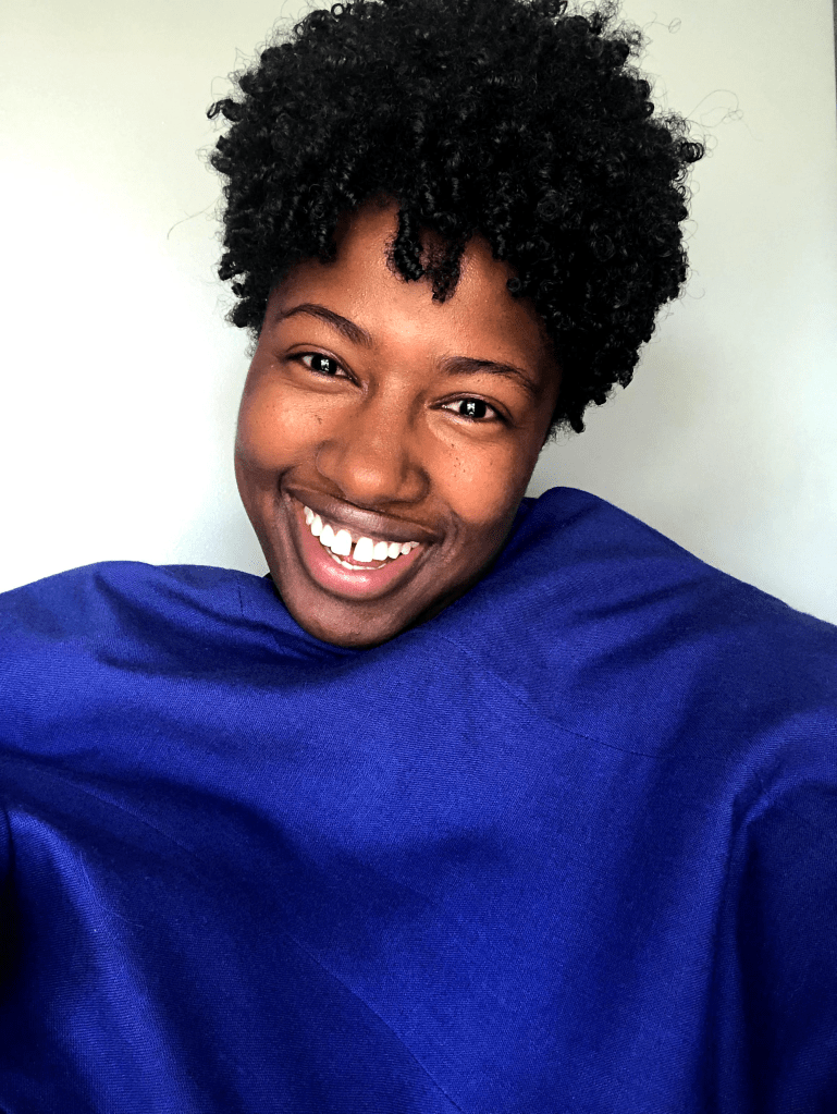
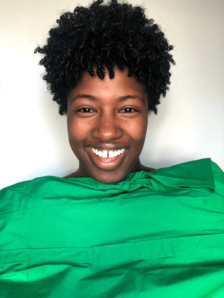
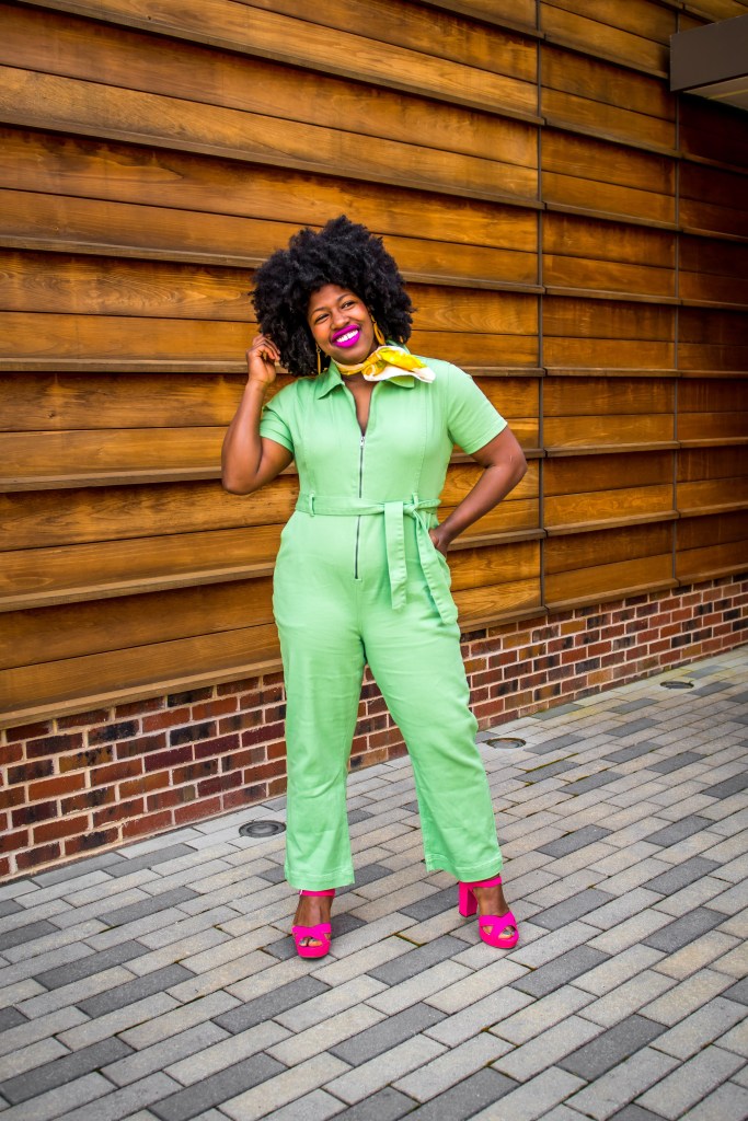
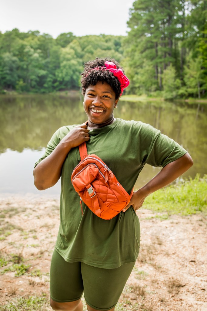
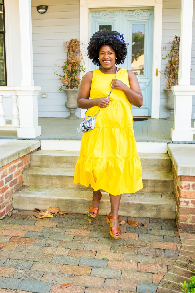
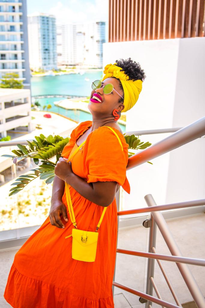
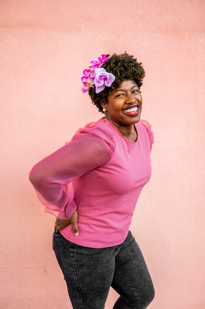
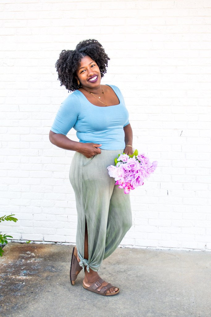
I am Warm Spring, but I can also pull off some of the colors in the Clear Spring palette as well. Tressie, my color consultant, provided me with a very detailed analysis of why these colors work for me and how they would work with my wardrobe and highlight my features. To say I was shocked at what my colors were is an understatement. I remember filling out the questionnaire and thinking, if they pick brown, navy or light yellow for me, I’ll be so disappointed because I thought those colors really didn’t look all that good on me, especially brown, mostly because my skin is brown and I felt like it fell flat on my skin. Well, surprise, all of these colors are in my palette of the best colors for me and I’m not AT ALL disappointed. In fact, it just further proves a color analysis was needed. After getting my full assessment, I immediately wanted to take action, and started scrolling through old photo albums to see if I was already dressing in the colors that suit me. Below are a few of the pics I pulled from throughout the years where I was getting it right with the Warm Spring palette vs where it was not the right color for me.
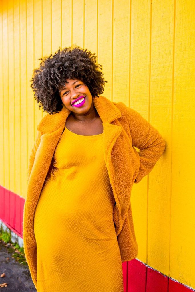
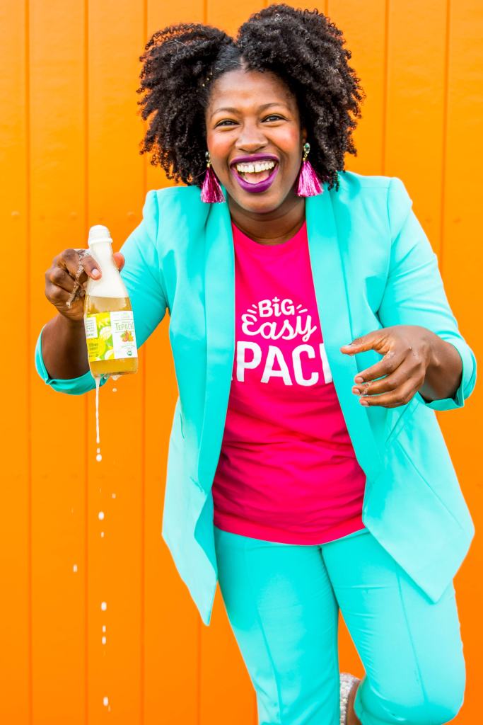
Scrolling through old blog pics post color consult was like looking at my wardrobe with fresh eyes. Now that I’ve been schooled on what my best colors are, some old pictures revealed that I was wearing colors that really weren’t my best colors. I’ve done so many shoots for my blog and for brands I’ve collaborated with in the past and some of the final photos for these shoots haven’t been my fave. Taking a glimpse back through old pics with the info I know now has me thinking perhaps the images weren’t my fave because of the colors I was wearing. I never thought the colors I wear for photos could make such a big impact on the final product. Often times, location, lighting, weather and a subjects energy level are the main things I consider when producing a good photo. Since receiving my color consultation, I’ve really changed the way I style myself for shoots and am way more attentive to the wardrobe colors I buy and while every shoot situation doesn’t afford me the opportunity to avoid my worse colors, I can at least be creative with the colors of the locations I shoot at and accommodate with the right make-up. Speaking of which, the pics below are from my most recent brand shoot. Keep scrolling so I can explain…

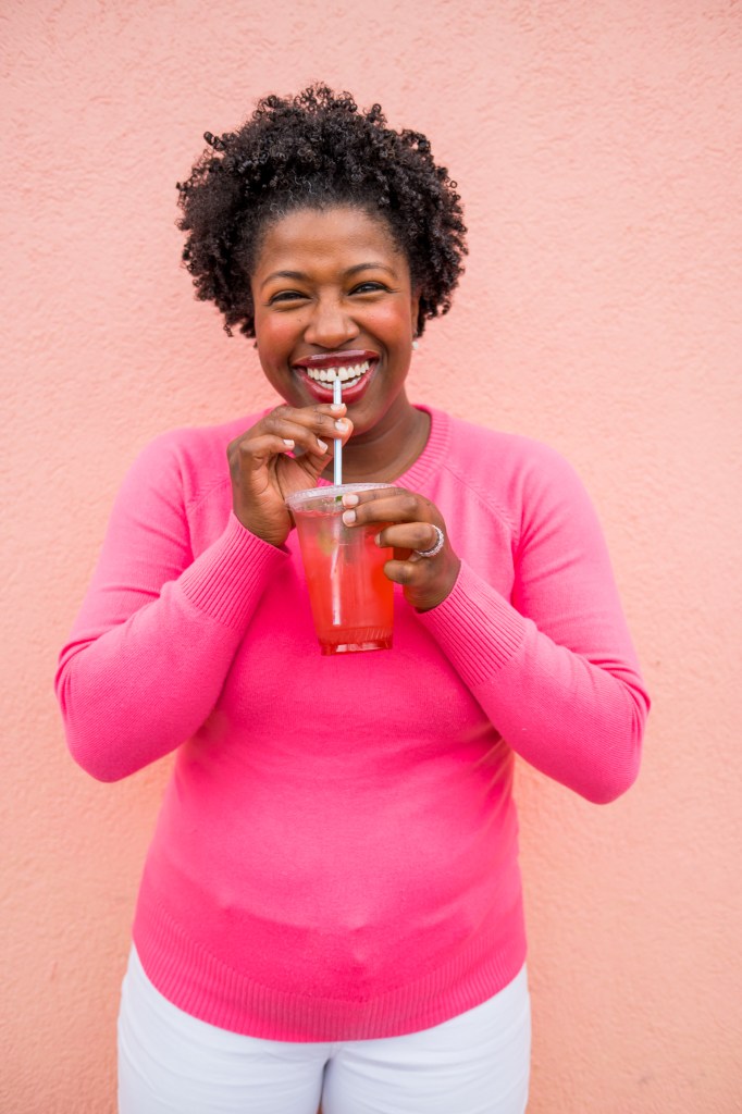
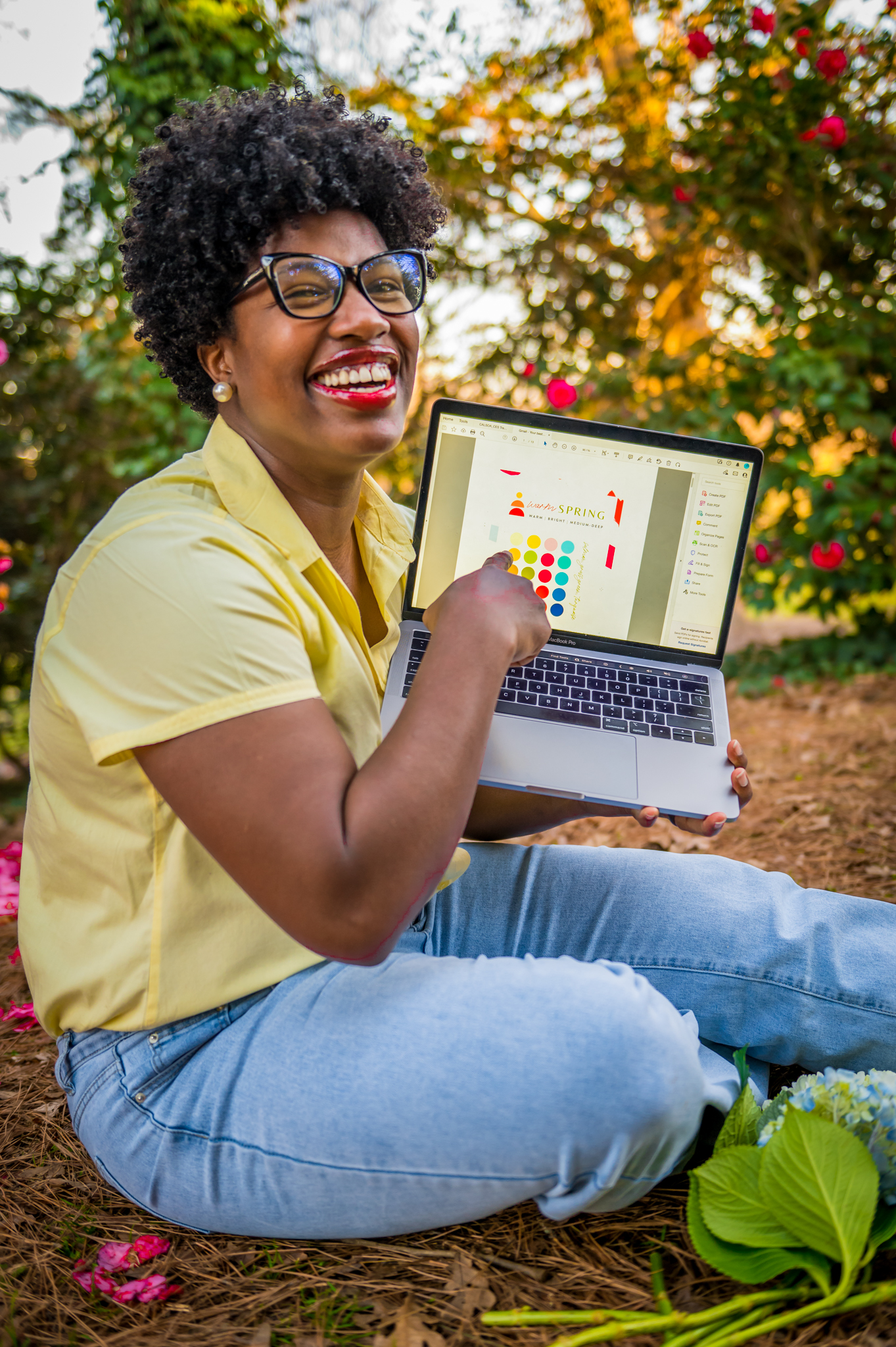
My color consultant, Tressie, mentioned increasing the warmth of my photos to enhance my features. For the above brand shoot, I was able to do this in editing along with wearing a flamingo pink (a color in the warm spring palette) and shooting at a peachy colored backdrop. I feel like everything aligned with the warm spring palette and it made such a huge difference in the photos and brought out the warm tones I have. My color analysis also recommended a few tips for Warm Spring make-up and I thankfully had a gloss that aligned with the palette and topped it off with a warm rose blush that definitely helped with bringing out my best features and played to the warm tones that I have, and not to brag or anything, but according to my color consultation, Beyonce is a Warm Spring, so there’s that, LOL.
My Created Colorful consultation has been such a game changer in how I prepare for photoshoots for brands I partner with. So much of the final photos I produce weighs heavily on the colors I wear and what shoot locations I choose. I’ll definitely be using the Warm Spring and Clear Spring palette to guide me on what colors I should wear on shoots and even use it as a guide for how I edit the final photos. This experience made me feel heard, not only as a woman of color, but as a woman period. It’s nice to feel included in spaces where I once felt like I had to be the expert all the time, and while I think we’re all experts over how we style ourselves, it’s nice to know efforts are being made to embrace the unique beauty of women of color, so they can feel supported in their goals as well.
Interested in a color consultation? Click here to learn more.
Till next time.
Sincerely,
Deidra Marie
